| Field | Description |
|---|
| Show Graph
|
Select this option to indicate that you want to include a graph on the report. All options are disabled until you select
Show Graph.
To set up a graph, you must first select at least one item on the Sorting/Grouping tab.
|
| Title
|
Enter a title for the graph.
|
| Type
|
Select the graph type. If you select
Bar Charts, then for each group that you specify on the Y axis, you can specify up to three columns or series for the X axis.
For example, you can set up a bar graph that groups by project and displays cost amount, billing amount, and budget amount for each project.
|
| Show 3D
|
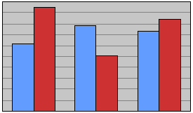
Select this option if you want the graph to appear to have three dimensions.
Example:
Select
3 Dimensional if you want the graph to look like this...
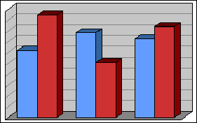
...rather than like this.
|
| Labels
|
Select a type of label. The choices vary depending on the graph type.
|
| Display Lines to Labels
|
Pie or doughnut charts only: Select this option to display a line that connects each slice to its label.
|
| Flip Axes
|
Bar charts only: Select this option to change the orientation to have the bars extend horizontally rather than vertically.
|
| Y Title
|
Bar charts only: Enter a label for data listed on the Y axis. When you make selections in
Display Data,
Vision displays a default title, but you can change it.
|
| Display Data
|
Select the data to be graphed by selecting a period and a type of data (for example,
Billed Amount or
Budgeted Amount).
For bar charts,
Vision combines these settings to create a default title for the Y axis in
Y Title. You can change that default title.
To graph a type of data, you must also select it on the Columns tab. For example, to graph
Billed Hours, you must also select
Billed Hours for the report on the Columns tab.
|
| Add Series
|
Bar charts only: You can select one or two additional series of data to display on the report. Select the
Add Series check box and select the type of data from the drop-down list.
To graph a series, you must also select the corresponding type of data on the Columns tab. For example, to graph
Labor Billed, you must also select
Labor Billed on the Columns tab.
|
| Add Slice
|
Pie or doughnut charts only: You can select one or two additional "slices" of data to display on the report. Select the
Add Slices check box and select the type of data from the drop-down list.
To graph a slice, you must also select the corresponding type of data on the Columns tab. For example, to graph
Labor Billed, you must also select
Labor Billed on the Columns tab.
|
| Display Amounts In
|
In this field, indicate whether you want to show graph amounts in the standard number or currency format for the corresponding report column, in thousands, or in millions.
For bar charts, your selection becomes the default title in
Y Title. You can change that default.
|
| X Title
|
The default title for the X axis in this field is based on the first level of grouping on the report. You can change that default text. If you change the first level of grouping,
Vision updates
X Title to match the new first level.
The only time that the first grouping level is not considered is when you add a slice for a pie chart. For example, if you group by project and select
Revenue for a slice, you get one slice for each project that has revenue. If you add a slice and select
Cost, you get one slice for total revenue and one slice for total cost.
|
| Slice By
|
For all types of charts except a bar chart, this field displays the first selected item on the Sorting/Grouping tab. That is the item used to "slice" the data selected in
Display Data. For example, if the first sorting/grouping item is
Project Number, each slice of the pie or doughnut chart represents the data for a
project.
If you select
Bar in
Type or you select one of the
Add Slice check boxes, this field does not display.
|
| Show
|
Select the location of the graph in the report. If you select
Graph only, the report displays the graph but does not display columns of data.
|
| Legend
|
Select the location of the graph legend.
The legend provides a color key to all graphed items. Regardless of the number of graphed items and the height of the legend, all of the graphed items are displayed. That can result in an unreadable legend because the items overlap. To correct that situation, change the record selection criteria for the report to reduce the number of graphed items, increase the height that you specify for the graph, or specify a smaller font size for the graph.
|
| Font Size
|
Specify the font size for the graph.
Vision uses this font size for all text and amounts associated with the graph.
|
| Width
|
Specify the width of the graph area in inches or millimeters based on which one you selected in the
Unit of Measure field on the Layout tab. If you use inches, use decimals for fractions of an inch (for example 3.50).
In the area defined by your entries in
Height and
Width,
Vision displays the graph itself, the graph title, and the legend.
|
| Height
|
Specify the height of the graph area in inches or millimeters based on which one you selected in the
Unit of Measure field on the Layout tab. If you use inches, use decimals for fractions of an inch (for example 3.50).
In the area defined by your entries in
Height and
Width,
Vision displays the graph itself, the graph title, and the legend.
|
| Top
|
Specify the top margin in inches or millimeters based on which one you selected in the
Unit of Measure field on the Layout tab. If you use inches, enter decimals for fractions of an inch. For example, enter
1.5 for an inch and a half.
If you intend to display the graph on your Dashboard, we recommend that you set the
Top and
Left options to 0 (zero).
|
| Left
|
Specify the left margin in inches or millimeters based on which one you selected in the
Unit of Measure field on the Layout tab. If you use inches, enter decimals for fractions of an inch. For example, enter
1.5 for an inch and a half.
If you intend to display the graph on your Dashboard, we recommend that you set the
Top and
Left options to 0 (zero).
|