Org Mgr Planning Performance Analytics
Use the Org Mgr Planning Performance Analytics dashboard to see project performance, utilization and other metrics at the organizational level against the plans.
This dashboard has 8 tabs that cover different views of the organization data.
- Overview - This tab shows year-to-date information based on the current year flag, so it will always show the YTD information through the current month which is controlled by your CER Administrator. The measures include Revenue, Profit, and Profit % as well as charts that compare actual revenue (at target rates) versus budgets.
- Current Period Review Analysis - This tab focuses on the current period performance showing revenue versus budget and gross profit (that is, revenue less direct expenses). The dashboard is filtered for Direct Projects only.
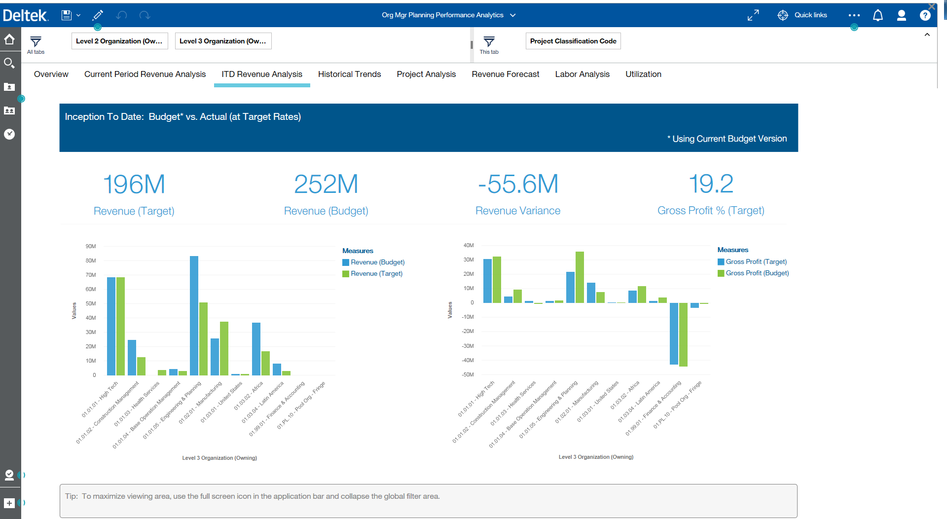
- ITD Revenue Analysis - This tab shows Inception To Date revenue for all projects to get an idea of historical performance showing revenue versus budget and gross profit. The dasbhoard is filtered for Direct Projects only. Note that all projects are shown whether Active or Inactive.
- Historical Trends - This tab shows comparison trends of actual versus current budget for each Organization at Level 3.
- Project Analysis - This tab goes deeper than the organization level to show project performance by Project Manager and percentage completion for the largest 10 projects. The % complete chart shows the top 10 projects labor cost to date and determines % of the total EAC budget for labor.
- Revenue Forecast - This tab shows the revenue forecast for the next 12 periods. Since the chart is using the relative time dimension for Future 12 Periods Trend, the timeframe will automatically shift after the current period is changed. This chart is only available on the Planning Dashboard, the information is not available in Costpoint Projects.
- Labor Analysis - This tab leverages the "tree map" visualization where each block is a level 1 project, the size of the block represents the number of hours spent in the current period. The color of each block represents the hourly variance from budget, the darker the color the larger the variance.
- Utilization - This tab breaks out the utilization by project classification. In aggregate, direct, indirect, total hours and the % of budget hours used for the period. In the bar chart, Org level 3 is broken out by project classification to show the utilization by % of hours spent in each classification.