Backlog Forecast Chart
The Backlog Forecast chart provides an overview of backlog trending for future periods based on a combination of existing project backlog and estimated pipeline revenue.
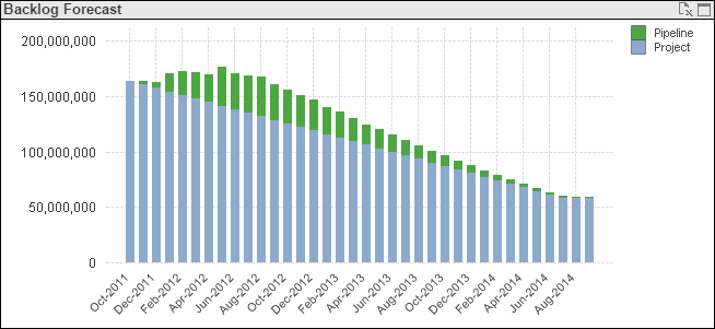
Chart Data
- Blue (lower) segment: Forecasted backlog for your existing projects as of the end of the period
- Green (upper) segment: Forecasted backlog for the opportunities in your pipeline as of end of the period
The Unweighted and Weighted options under Pipeline Probability Weighting provide the additional option to calculate forecasted backlog using either unweighted pipeline amounts or weighted pipeline amounts (pipeline amounts that are adjusted based on win probability).
Hover over a bar segment to display a tooltip containing the backlog amount represented by that segment.
Supporting Tables
The Pipeline Revenue columns in the Forecast by Opportunity table and Forecast by Project table indicate the contribution of each opportunity or project to the Revenue Forecast for each period. The Change in Backlog columns indicate the corresponding changes in backlog. For example, if an opportunity is expected to contribute 10,000 in revenue for a period, that increases forecasted revenue and decreases backlog by that amount. 10,000 displays in Pipeline Revenue and (10,000) displays in Change in Backlog for that opportunity and period.
As Of Dates
- The Project As Of date is the end date of the earliest fiscal period for which project backlog forecast data is included.
- The Pipeline As Of date is the earliest date for which pipeline forecast data is included.
Filter Options
- Forecast data for a specific company (if your firm has multiple companies in Costpoint).
- Forecast data for one or more specific organization codes. Use the
 icon at the top of the
Org filter list to display organization codes for all levels of the organization structure or only the organization codes for a specific level. (If
~No Value~ displays in the
Org list, it indicates that one or more opportunities are not assigned to an organization. You can select
~No Value~ to focus the chart on those opportunities.)
icon at the top of the
Org filter list to display organization codes for all levels of the organization structure or only the organization codes for a specific level. (If
~No Value~ displays in the
Org list, it indicates that one or more opportunities are not assigned to an organization. You can select
~No Value~ to focus the chart on those opportunities.)
Export to Excel
To export the data underlying this chart to a Microsoft® Excel® spreadsheet, click
 in the upper-right corner of the chart.