Cash Waterfall Chart
The Cash Waterfall chart provides a graphical representation of the period-by-period impact of deposits and disbursements on your cash balance for the current fiscal year.
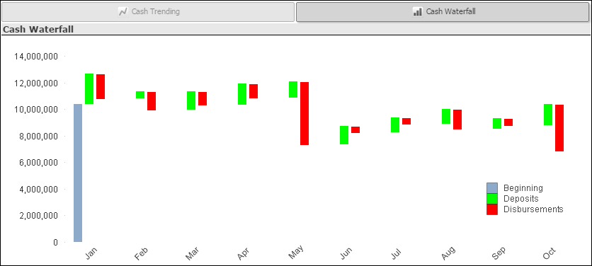
For each period, the green bar indicates the increase in cash from deposits and the red bar indicates the decrease resulting from disbursements. The bottom of the green bar marks the beginning cash balance for the period and the bottom of the red bar marks the ending balance.
To display the actual amount that a bar represents, hover over that bar with the mouse pointer.
Filter Options
Use the filter lists on the left side of the dashboard to focus the chart on...
- Cash amounts for a specific company (if your firm has multiple companies in Costpoint)
- Cash amounts associated with one or more specific organization codes. Use the
 icon at the top of the
Org filter list to display organization codes for all levels of the organization structure or only the organization codes for a specific level.
icon at the top of the
Org filter list to display organization codes for all levels of the organization structure or only the organization codes for a specific level.
You can also focus on a single cash account by clicking the row for the account in the Cash Account Details table.