Risk Analysis Histogram View
A risk analysis histogram view displays probability information about a key activity against a time scale in a histogram format.
To display a risk histogram in Open Plan, the following conditions must be met:
- You must have performed risk analysis for the project.
- The project must have at least one activity designated as a key activity.
- You have selected an activity to display. Click Select Activity from the View tab or right-click the workspace and click Select Activity from the shortcut menu.
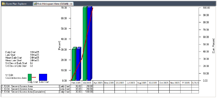
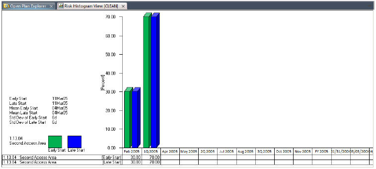
The risk analysis histogram view presents the detailed picture of the probability distribution for calculated dates for a key activity.
Using the Risk Analysis Preferences dialog box, you can select any of the following dates for use in the Risk Analysis Histogram View:
- Early start
- Early finish
- Late start
- Late finish
As in the case of resource histograms, each bar in a risk histogram represents a value corresponding to the smallest time unit displayed on the date scale. For example, if you define a date scale with the most detailed axis showing months, you can display bars that show how many times a key activity finished in a given month:
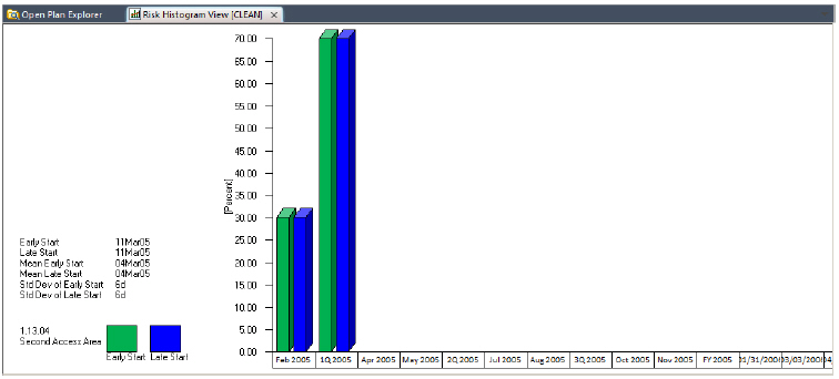
Each bar in the view represents a value corresponding to a percentage of trials that results in a calculated date within the smallest time unit displayed on the date scale. For example, if you define a date scale with a single axis showing weeks, you can display early start bars that represent the percentage of trials that resulted in an early start during each week. In this way, you can display probability information aggregated on an hourly, daily, weekly, monthly, quarterly, or yearly basis.
A legend that explains the colors used for the bars and S-curves displays at the left side of the risk analysis histogram view. Against the left-hand axis, Open Plan prepares a scale representing the percentage of risk analysis iterations that occurred in a given time interval. The right-hand axis represents the cumulative distribution of the dates.
If you prefer to see the precise values represented in the view, you can configure a risk analysis histogram view to display information in a tabular format below the bars. It is also possible to display just the tabular portion of the view.
It is also possible to display just the tabular portion of the view.
As in the case of the bars, the aggregation of tabular data corresponds to the smallest unit displayed on the date scale.
In addition to displaying information aggregated on a period-by-period basis, you can display S-curves representing the cumulative results of multiple trials. This feature is especially useful for estimating how much confidence is associated with a particular start or finish date.