Examples of chart widgets
Select a chart type below to see some examples of different charts you can build in the widget designer.
Bar
Column
Scatter
Line
Area
Pie
Donut
Funnel
Bubble
Chart Type: Bar
| Example of widget
|
Balances widget |
| Purpose
|
Show the balance left in different accounts. |
| Widget Base
|
Home |
| Columns used
|
- Cash
- Payable Balance
- Receivable Balance
- WIP Balance
|
| Filter/Sort/Group
|
None |
| What it would look like
|

|
Chart Type: Column
| Example of widget
|
Aging widget |
| Purpose
|
To see the aging of Payable, Receivable, and WIP Balance |
| Widget Base
|
Home |
| Columns used
|
- Payable Balance
- Receivable Balance
- WIP Balance
|
| Filter/Sort/Group
|
Grouped by Date > Aging |
| What it would look like
|

|
Chart Type: Scatter
| Example of widget
|
Bank Account Balance for past 6 months |
| Purpose
|
To show the bank account balance for past 6 months |
| Widget base
|
Bank Account |
| Columns used
|
|
| Filter/Sort/Group
|
Grouped by date past 6 months |
| What it would look like
|

|
Chart Type: Line
| Example of widget
|
Trends |
| Purpose
|
To see the trend over past months for Payables, Receivable, WIP, and Cash |
| Widget base
|
Home |
| Columns used
|
- Cash
- Payable Balance
- Receivable Balance
- WIP Balance
|
| Filter/Sort/Group
|
Grouped by Date |
| What it would look like
|
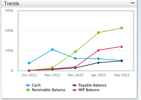
|
Chart Type: Area
| Example of widget
|
YTD Profit Margin – Project Type |
| Purpose
|
To compare profit Margin by Project Type |
| Widget base
|
Project Type |
| Columns used
|
|
| Filter/Sort/Group
|
Grouped by Project Type |
| What it would look like
|

|
Chart Type: Pie
| Example of widget
|
Receivable Balance - Client Type |
| Purpose
|
To show the receivable balance by Client type |
| Widget base
|
Client Type |
| Columns used
|
- Receivable Balance
- Description
|
| Filter/Sort/Group
|
Grouped by Description |
| What it would look like
|

|
Chart Type: Donut
A donut chart contains the same visual attributes as a pie chart with a hollow center. In the widget designer, chart options allow you to control:
- Start/End Angle which controls if the chart is displayed at 180, 360 or in between
- Inner size which determines the size of the thickness of the donut
- The placement of the donut in the chart area.
| Example of widget
|
YTD Utilization - Hours |
| Purpose
|
To show the Year to date Utilization by description |
| Widget base
|
Transaction |
| Columns used
|
- Hours
- Utilization Description
|
| Filter/Sort/Group
|
Grouped by Utilization Description |
| What it would look like
|
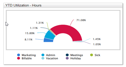
|
Chart Type: Funnel
A funnel chart is a graphical representation used to visualize how data moves through a process, for example a sales process. In a funnel chart, the dependent variable’s value diminishes in the subsequent stages of the process. By viewing the subsequent stages of a process, readers can quickly identify bottlenecks.
| Example of widget
|
BD Pipeline by Stage |
| Purpose
|
To see how things are moving through stage processes like BD Stage process |
| Columns used
|
- Current Stage
- Contract Amount
|
| Filter/Sort/Group
|
Grouped by Current Stage |
| What it would look like
|
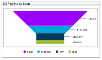
|
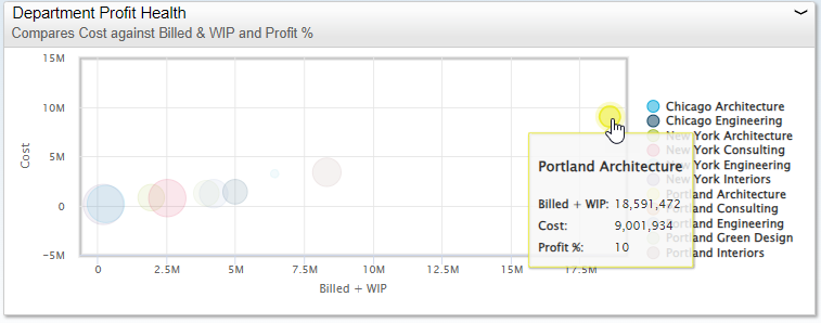
Chart Type: Bubble
Bubble charts tell a story visually between different data sets using three fields of data. Bubble charts are used when data needs a third dimension to provide richer information to viewers. Bubble charts are not ideal if you want to see exact values, if you want to plot more than two values on the x/y axis, if there are overlapping bubbles, or there are negative or zero values. Bubble charts also provide a way to visually identify outliers.
| Note: |
Links are disabled for bubble charts. |
| Example of widget
|
Compares Cost Against Billed + WIP and Profit % |
| Purpose
|
It makes it easy to see which departments have the highest Revenue and Cost, as well as identifying which ones have the highest profit percent. In this example, you can see that Portland Architecture has the highest Revenue & Cost and a smaller profit percent. While projects with smaller Revenue & Cost have larger profit percent. |
| Columns used
|
- Billed + WIP (as the X-Axis)
- Cost (as the Y-Axis)
- Profit % (as the Z. This determines the size of the bubble)
|
| Filter/Sort/Group
|
Grouped by Department |
| What it would look like
|
|