Resource Utilization by Organization Chart Tab
Use the Chart tab to choose the type of chart to be displayed on your report.
Chart Type
| Field | Description |
|---|---|
| No Chart | Do not create a chart for this report. |
| Column Chart | A chart that renders bars vertically.
If you select Column Chart, then for each group that you specify on the X axis, you can specify up to three columns or series for the Y axis. For example, you can set up a column chart that displays cost amount, billing amount, and budget amount for each project groups by project and . |
| Chart Only Report | Select this option to generate the report with the chart but without the columns of data. |
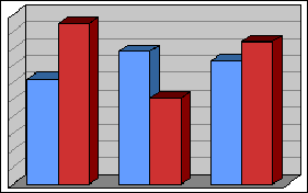
| Make Chart 3D | Use this toggle if you want to render the chart type as a three dimensional model.
Example: Drag the toggle to the on position (
...or drag toggle to the off position (
|
 ) if you want the chart to look like this...
 ) if you want the chart to look like this:
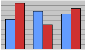
Chart Options
| Field | Description |
|---|---|
| Chart Title | Enter a title for the chart. |
| Value of Y-Axis |
Select one of the following to indicate the values on the Y-axis:
|
| Display Value Labels in Columns | Select this check box to display the number of full-time equivalents or hours on each column. |
| X Axis Title | This option appears only on column and bar charts. The default title for the X axis is the label of the first level of grouping on the report. You can change that default text. If you change the first level of grouping, Vantagepoint updates X Axis Title to match the new first level. |
| Y Axis Title | This option appears only on column and bar charts. Enter a label for data listed on the Y axis. When you make selections in the Display Data field, Vantagepoint displays a default title, but you can change it. |
| Show Chart For |
Select one of the following options to indicate where in the report you want Vantagepoint to display a chart graph:
|
| Font Size | Specify the font size for the chart. Vantagepoint uses this font size for all text and amounts associated with the chart. |
| Chart Height | Specify the height of the chart area in inches or millimeters based on the Unit of Measure field on the Layout tab. If you use inches, use decimals for fractions of an inch (for example 3.50). The chart title, legend, and chart will display in the area defined. |
| Chart Width | Specify the width of the chart area in inches or millimeters based on the Unit of Measure field on the Layout tab. If you use inches, use decimals for fractions of an inch (for example 3.50). The chart title, legend, and chart will display in the area defined. |
| Top Alignment | Specify the top margin in inches or millimeters based on the
Unit of Measure field on the Layout tab. If you use inches, enter decimals for fractions of an inch. For example, enter
1.5 for an inch and a half.
If you intend to display the chart on your Dashboard, we recommend that you set the Top and Left options to 0 (zero). |
| Left Alignment | Specify the left margin in inches or millimeters based on the Unit of Measure field on the Layout tab. If you use inches, enter decimals for fractions of an inch. For example, enter 1.5 for an inch and a half. |
Set Chart Data
| Field | Description |
|---|---|
| Display Capacity Line | Select this check box to display a thick, dashed line across the graph to indicate the capacity for the organization or for the company. If you select this option, you cannot select the Make Chart 3D option. |
| Show Probability % Range |
Use these fields to specify the range of plan probability percentages. Valid entries are 0 to 100. The ranges cannot overlap. For example, if the ending value for one range is 80, the starting percentage for the next range must be 81 or greater. Vantagepoint uses the estimate of the probability that a plan will become a project in the Probability field on the Summary pane of the Projects hub to generate the graph. |
| Label | Enter a label for each probability percentage range. |
| Color | Select a color for each plan probability range. Vantagepoint displays the corresponding stacked segments in those colors on the graph. |