Win Rate Trended Chart
Chart Item |
Description |
Horizontal axis: calendar
months, quarters, or years |
The
horizontal axis displays the range of calendar months, quarters,
or years included in the win rate analysis period. You can use
the Cycle button ( ) to cycle through
the three analysis period options. ) to cycle through
the three analysis period options. |
Vertical axis: win
rate |
The
vertical axis displays the win rate range (0 – 100 percent). |
Chart line: win rate
by month, quarter, or year |
Each
intersection of the chart line with the grid line for a time segment
represents the win rate for opportunities that have a win rate
analysis date within that month, quarter, or year. |
Data Item |
Description |
Win rate for a period |
Number
of won opportunities ÷ (Number of won opportunities + Number of
lost opportunities)
Or
Pipeline amount for won opportunities ÷ (Pipeline
amount for won opportunities + Pipeline amount for lost opportunities)
The calculation used depends on whether you
select Count or Amount in Display
Trended Rates Based On. The rate is displayed as
a percentage. |
For descriptions of the sources of the chart data, see Data Sources.
Your firm uses the opportunity awarded date as the win rate analysis
date. Of the opportunities with an awarded date in November 2012, the
total pipeline amount for the won opportunities and lost opportunities
are the following:
Won opportunities: $2,000,000
Lost opportunities: $3,000,000
When you select Amount in Display
Trended Rates Based On, Capture Analytics displays a 40% win rate
for November 2012:
2,000,000 ÷ (2,000,000 + 3,000,000) = .4 = 40%
As part of the Costpoint Analytics configuration
process, your system administrator specifies the date field from opportunity
records in GovWin Capture Management that Costpoint Analytics uses to
build the calendar for the win rate portion of the Bid and Win Rate Analytics.
That calendar is used to determine which opportunities to include in the
win rate calculations when you use the calendar bar to select an analysis
period.
For example, your firm could use the opportunity
awarded date. When you use the year options above the Win Rate Trended
chart to specify an analysis period for win rates, Costpoint Analytics
includes all won and lost opportunities with an awarded date that falls
within that year.
The win rate analysis date can be, and often is,
different than the bid rate analysis date. If the two date fields are
the same, however, the analysis period you select for the win rate analytics
is automatically applied to the bid rate analytics as well.
As part of the Costpoint Analytics configuration
process, your system administrator specifies how Costpoint Analytics is
to determine which opportunities are won and lost opportunities for the
purpose of calculating your firm's win rates. That determination can be
based on stage, on a user-defined field from the Opportunity table in
GovWin Capture Management, or on a combination of the two.
For more information, see Bid
and Win Rate Settings.
When your firm implements Capture Analytics, it can
select two amount fields from opportunity records in GovWin Capture Management
to analyze as pipeline. The options under Pipeline
Amount enable you to display win rates calculated using amounts
from either of those two fields. If you select Amount
in Display Trended Rates Based On,
Capture Analytics displays win rates for Win Rate Trended chart based
on amounts from the selected field.
Pipeline amounts used to calculate win rates are
unweighted amounts.
Click  at the top right of the chart
to display the chart at its maximum size. Click
  to restore the chart to its original size and location on the tab.
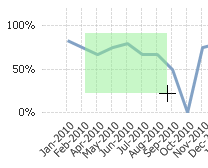
To focus the chart on a particular set of data points, click and drag
the mouse pointer over the chart so that the green selection area touches
only the data points you want to include.  Illustration
To focus the chart on a more restricted analysis period, do either
of the following:
Specify
the analysis period using the year options above the chart.  Illustration
Click
and drag the mouse pointer over the data points in the chart so that
the green selection area touches only the data points for the months,
quarters, or years you want.  Illustration
It is much easier to make selections on the chart
itself if you first maximize the chart.
If you use any of the above actions to change the chart, Capture Analytics
applies the same changes, as appropriate, to other analytic objects.
Use the Cycle button ( ) to select any of the three
analysis period options for the horizontal axis: Month,
Quarter, and Year:
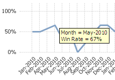
To see the win rate data for a specific data point,
position the mouse pointer over the intersection of the chart line and
the grid line for the time segment. When you do, Capture Analytics displays
the month, quarter, or year and the win rate.  Illustration
It is much easier to position the mouse pointer
over a data point if you first maximize the chart.
Click  to send the data underlying
the chart to Microsoft Excel. More...
![]() ) to cycle through
the three analysis period options.
) to cycle through
the three analysis period options.
