
Filter and Table Column Types
The Maconomy web client offers a variety of column element types to be used within tables and list views, filters and filter-as-table. This article describes the API for each of these elements, and a few examples of their use. With the exception of the action element type not being available in list views, all element types can be used in the layout parts mentioned.
Further information on all the column types mentioned below, is available in the JSON configuration section of this guide.
Column elements are wrapped in a columns array.
{
  "columns": [
    ...
  ]
}
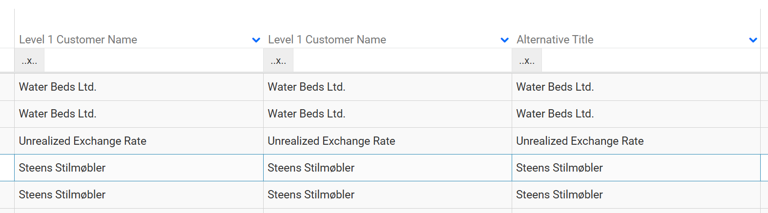
Field
This is the basic column type. It can be configured in shorthand, simply as a source name describing the data of the field.
{
  "columns": [
    "CustomerLevel1Name"
  ]
}
Or as an object, with a source describing the data of the field.
{
  "columns": [
    {
      "field": {
        "source": "CustomerLevel1Name",
      }
    }
  ]
}
The field element object can contain such properties as title, visible, open, and so on. Most of these properties are also available in the elements described below.
{
  "columns": [
    {
      "field": {
        "T$title": "Alternative Title",
        "open": "false",
        "visible": "true",
        "source": "CustomerLevel1Name",
      }
    },
  ]
}
Link
The link column type represents a link that can navigate to a specified URL.
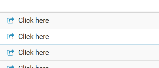
"link": {
  "T$template": "Click here",
  "icon": "icon-openoutside",
  "workspace": "ShowInvoice",
  "query": [
    {
      "InvoiceNumber": "^{InvoiceNumberField}"
    }
  ]
}
Action
Action allows the end-user to interact with the data shown in a workspace. It can invoke wizards, or actions on a container.
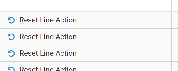
"action": {
  "source": "ResetLine",
  "T$template": "Reset Line Action",
  "icon": "fas fa-undo"
}
Text
The text column type represents a column element which does not display any field data.
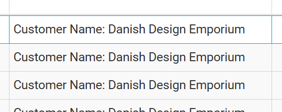
"text": {
  "T$template": "Customer Name: ^{CustomerLevel1Name}"
}
UnitField
The unitField column type represents a column element with a unit describing the data of the field.
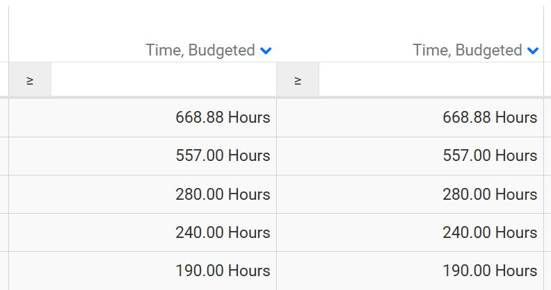
The unit can be a hardcoded string value and position.
"unitField": {
  "source": "TimeQuantityBudgeted",
  "unit": {
    "title": "Hours",
    "position": "postfix"
  }
}
Alternatively, the unit can be a source describing the data of a field (in this case, the data value of the TimeRegistrationUnit field).
"unitField": {
  "source": "TimeQuantityBudgeted",
  "unit": {
    "source": "TimeRegistrationUnit"
  }
}
Amount
The amount column type represents a column element with a currency describing the data of the field.
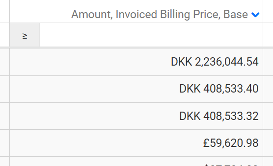
"amount": {
  "source": "AmountInvoicedBillingPriceBase",
  "currency": "InvoiceCurrency"
}
Percent
The percent column type represents a column element with a hardcoded percent unit.
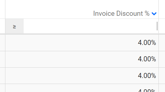
"percent": {
  "source": "InvoiceDiscountPercentage"
}
FileSize
The fileSize column type represents a column element with a hardcoded file size unit.

"fileSize": {
  "source": "DocumentSize"
}
Status
The status column type is used in tables for rendering status information about a record. The source represents the underlying pane field that provides data for the element.
A mask maps a given internal status value to a title and css. Here for example, the status values of 'open' and 'reopened' are mapped to the title 'Due' and the color 'red'. The status of 'submitted' is mapped to the title 'Submitted' and the color 'green'.
The optional color can be either a reference to a palette item, for example, "palette1.item2", or a standard web color such as a hex triplet, an RGB value or a named HTML color.
The optional info property is a definition of an inline info-bubble or a reference to a reusable info-bubble.
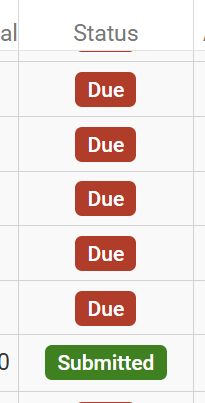
"status": {
  "source": "WorkflowStatus",
  "mask": {
    "open, reopened": {
      "T$title": "Due",
      "color": "WorkflowStatus.Red"
    },
    "submitted": {
      "T$title": "Submitted",
      "color": "WorkflowStatus.Green",
      "info": {
        "ref": "WorkflowStatusInfoBubble",
        "parameters": {
          "Status": "AbsenceCalendarLinesCard"
        }
      }
    },
    ...
  }
}
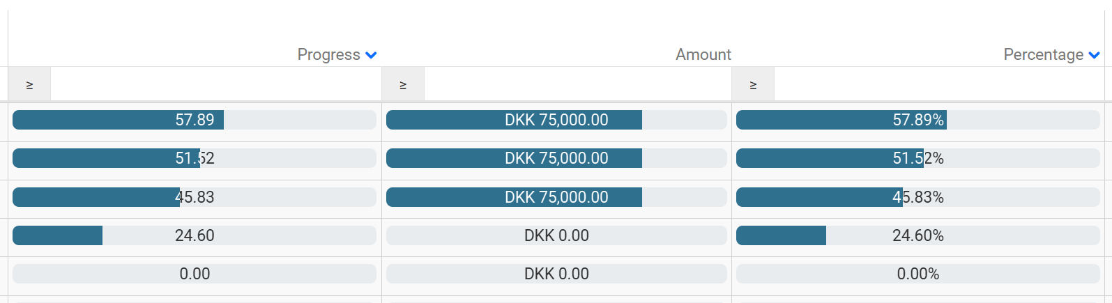
Progress
You can now display the values for specific columns in tables and filters as progress bars. The element consists of a bar, a label, and a tooltip. The latter providing further information on the range as well as the field value. Many of the properties available to other column types are available for progress.
There are three sub-types outlined below: basic, amount, and percentage. Moreover, information on progress bar-specific properties (range, animated, unit, regions, and text suppression) are also outlined below.
A layout can be found showing examples of progress bars for tables and filters, at Tests/Layout/Progress Bars/Progress Bars In Tables.
Progress Column
This is the basic progress column type with a source describing the data of the field. Properties such as title, width, and so on can be included. However, range is mandatory.
"progress": {
  "source": "JobProgressTimeQuantity",
  "range": 100
}
Amount Progress Column
The amount progress column type represents a progress element, with amount describing the data of the field, and currency describing the data of the currency field. Properties such as title, width, and so on can be included. However, range is mandatory.
"progress": {
  "amount": "FixedPriceCurrency",
  "range": 10000000,
  "currency": "Currency"
}
Percentage Progress Column
The percentage progress column type represents a progress element with percent describing the data of the field. Properties such as title, mandatory, width, and so on can be included. The range property is inferred by this being a percentage progress column type.
"progress": {
  "percent": "JobProgressTimeQuantityPercentage"
}
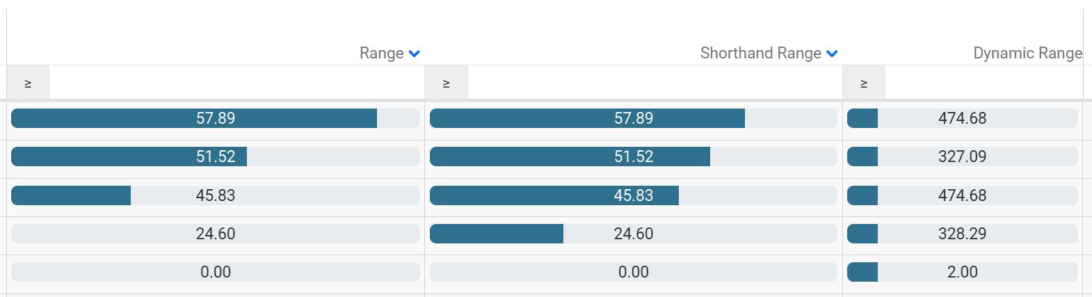
Range
A column part that has a range, representing the maximum and minimum values for the progress bar. The range can be an object containing number, or string values describing the data of a field. It can also be configured in shorthand to represent the maximum value of the progress bar. The minimum value is then hardcoded as zero.
{
  "columns": [
    {
      "progress": {
        "source": "JobProgressTimeQuantity",
        "range": {
          "min": 40,
          "max": 60
        }
      }
    },
    {
      "progress": {
        "source": "JobProgressTimeQuantity",
        "range": 75
      }
    },
    {
      "progress": {
        "source": "AmountRevenueRecognizedEnterprise",
        "range": "AmountRevenueRecognizedBase"
      }
    }
  ]
}
Animated
Interface representing whether a progress bar can be animated.
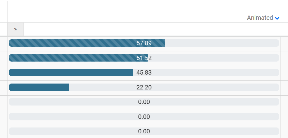
"progress": {
  "source": "JobProgressTimeQuantity",
  "range": 100,
  "animated": "JobProgressTimeQuantity > 50"
}
Unit
A column part that can optionally carry a unit label.
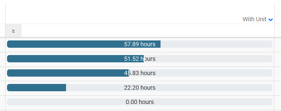
"progress": {
  "source": "JobProgressTimeQuantity",
  "range": 100,
  "unit": {
    "title": "hours",
    "position": "postfix"
  }
}
Regions
A column part that can optionally carry regions. Regions are used to colorize the progress bar based upon whether the data of the source field falls within one of the regions specified.
Each region can have either start and end properties, or above and below properties. (It is possible to have only an above or only a below property.) These properties can either be a number, or a string value describing the data of a field. The variant string refers to a bootstrap theme color.
If no regions are specified, or the source field value falls outside all of the specified regions, the default color will be displayed.
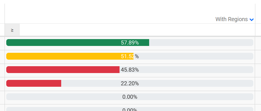
With start and end properties.
"progress": {
  "source": "JobProgressTimeQuantity",
  "T$title": "With Regions",
  "range": 100,
  "regions": [
    { "start": 0, "end": 46, "variant": "danger" },
    { "start": 47, "end": 52, "variant": "warning" },
    { "start": 53, "end": 100, "variant": "success" }
  ]
}
And with above and below properties providing the same output.
"progress": {
  "source": "JobProgressTimeQuantity",
  "T$title": "With Regions",
  "range": 100,
  "regions": [
    { "below": 47, "variant": "danger" },
    { "above": 46, "below": 53, "variant": "warning" },
    { "above": 52, "variant": "success" }
  ]
}
Suppress
A condition specifying when this progress column cell's text should be suppressed. If not specified, the text will be shown.
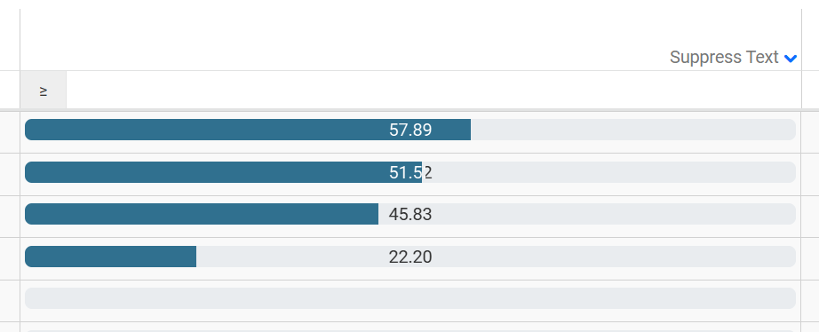
"progress": {
  "source": "JobProgressTimeQuantity",
  "T$title": "Suppressed Text",
  "range": 100,
  "suppress": "JobProgressTimeQuantity = 0"
}