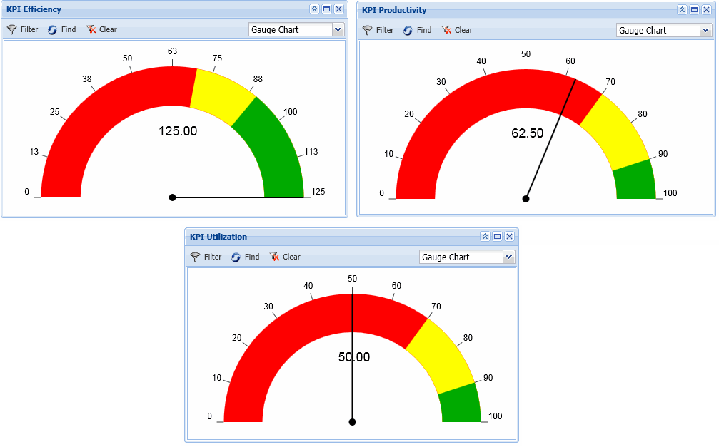
The KPI Dashboard displays charts with Key Performance Indicators: Efficiency, Productivity, and Utilization. You can display this data for one or more employees. You can also select the date range for which to display this data. The KPI portlets can be displayed as gauges or numeric charts.
To display a portlet, select it from the Available Portlets drop-down list at top of the dashboard. The portlets that you can view in the KPI Dashboard must be enabled in your Security Role. You can also change the filter fields in a KPI portlet by modifying them in your Form Profile.

The KPI portlets are also available in the Supervisor Dashboard.
See Also:
Display a Gauge or Numeric Chart
Modify the Colors and Numeric Values in a KPI Portlet
The KPI Efficiency portlet shows the Efficiency percentage for the selected employees and date range.
An employee’s Efficiency is based on the amount of labor the employee performed compared to a labor standard (measured in hours per piece).
Efficiency = Earned Hours / Production Hours
Earned Hours for a transaction are calculated as the Quantity Completed times the Standard (the expected rate of production per unit time).
Production Hours are hours spent toward actual production (e.g., Labor event hours). Non-production hours may include training or team meetings.
For example, an employee works 4 hours and completes a quantity of 5. The labor standard is 1 hour/piece. In other words, the employee did 5 hours of work in 4 hours. The employee’s efficiency is calculated as Earned Hours / Production Hours. Earned Hours are Quantity * Standard (in this example, 5 * 1). Production Hours (time spent on “productive” work) are 4. The employee’s Efficiency is 5/4 = 125%.
The calculations for Earned Hours and Production Hours are configured on the Calc Rule form using the Analytics context.
Note: Efficiency is calculated for individual transactions on the Labor Review form. In the KPI Efficiency portlet, the calculation is done for one or more employees for a specified date range.
The KPI Productivity portlet shows the Productivity percentage for the selected employees and date range. Productivity measures the amount of labor an employee performs during the time they were present at work.
Productivity = Earned Hours / Attendance Hours
Earned Hours for a transaction are calculated as the Quantity Completed times the Standard (the expected rate of production per unit time).
Attendance Hours are the total number of hours recorded for the day.
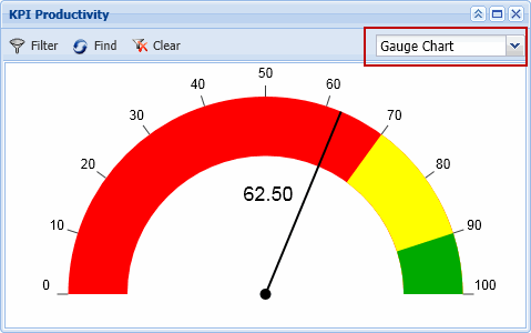
For example, an employee posts 4 Sick hours and 4 Labor hours in a day. The employee has 8 Attendance Hours. On this day, the employee completes a quantity of 5. The labor standard is 1 hour/piece. Earned Hours are Quantity * Standard (in this example, 5 * 1). The employee’s Productivity is 5/8 = 62.5%.
The calculations for Earned Hours and Attendance Hours are configured on the Calc Rule form using the Analytics context.
The KPI Utilization portlet shows the Utilization percentage for the selected employees and date range.
Utilization is the measure of how well an organization is avoiding non-productive time.
Utilization = Production Hours / Attendance Hours
Production Hours are hours spent toward actual production (e.g., Labor event hours). Non-production hours may include training or team meetings.
Attendance Hours are the total number of hours recorded for the day.
For example, an employee works 40 hours in a week but spends 5 hours in meetings (considered “non-production” time). The employee’s Utilization percentage for the week would be 35/40 = 87.5%.
Note that the maximum percentage for Utilization is 100%, whereas Efficiency and Productivity may be greater than 100%.
Use the Auto Refresh button to turn automatic refresh on and off. When Auto Refresh is enabled, the KPI portlets will refresh automatically based on the form_refresh_time value i
on the Form Settings form. The default value is 180 seconds (3 minutes). Click Auto Refresh again to turn this feature off.
You can also refresh the KPI portlets at any time by clicking the Find button.
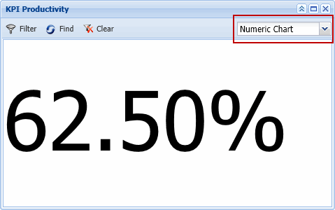
Select Gauge Chart or Numeric Chart at the top of a KPI portlet to change the display accordingly.


When you display the portlets, they automatically resize so they will all fit in your screen.
You can display up to three portlets across your screen horizontally.
You can drag the bottom of a portlet to resize it vertically.
You can also use the ![]() buttons in the top right corner of the portlet to minimize, maximize,
and close the window.
buttons in the top right corner of the portlet to minimize, maximize,
and close the window.
To minimize a portlet, click the minimize ![]() button. Only the title bar will display.
button. Only the title bar will display.
Click the ![]() button to return
the portlet to its previous size.
button to return
the portlet to its previous size.
To maximize a portlet, click the ![]() button. When the portlet is maximized, click the
button. When the portlet is maximized, click the ![]() button to restore it to its previous size.
button to restore it to its previous size.
Click the ![]() button to close
the portlet. To open it again, select it from the Available
Portlets field.
button to close
the portlet. To open it again, select it from the Available
Portlets field.
Click the ![]() Filter
button at the top of the KPI Dashboard and in each individual KPI portlet
to display the filter fields.
Filter
button at the top of the KPI Dashboard and in each individual KPI portlet
to display the filter fields.
Use the filter fields at the top of the dashboard (Facility, Supervision Type, and Include Direct) to select a group of employees for whom the KPI data will be calculated. The maximum number of employees for which the data can be displayed is controlled by the max_supervisor_records Application setting.
Use the filter fields in the individual portlets to select the Date Range for which the KPI data will be calculated. You can also enter a Employee/Person number to display the data for a single person.

Use the Other Context tab of the Color Policy form to change the look of the KPI charts.
The changes you make in the Color Policy will affect the:
Background color of the portlet window
Color of the numbers in the chart
Color of the needle in the gauge chart
Color of the three zones in the gauge chart
Upper limit of the low and middle zones in the gauge chart