|
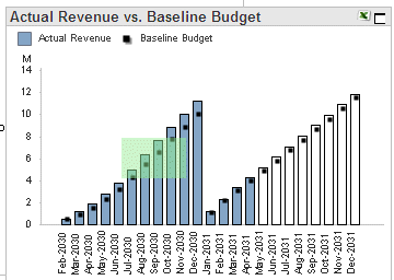
This bar chart displays the actual or target revenue trends for prior and current periods, and budget or forecast revenue amounts for future periods. You can select the how you want to view revenue, either over a specific time period or year-to-date (YTD). These options give you the ability to accurately assess the different aspects of revenue for your entire firm, or for individual organizations.
|
In this topicPrior Year Revenue Adjustments User Options That Affect the Chart |
|
Chart Item |
Description |
|
Horizontal axis: timeframe |
The horizontal axis displays the fiscal periods included in the analysis period. |
|
Vertical axis: current value |
The vertical axis displays the scale for revenue amounts. |
The following data displays on this chart:
|
Chart Item |
Description |
|
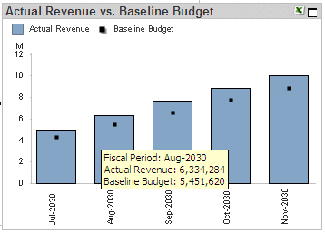
Bars |
The chart displays the revenue trends for the analysis period. The actual revenue amounts display as filled bars. The projected revenue amounts for future months display as clear bars. If the data model includes a prior year revenue adjustment amount for a fiscal period, the adjustment amount displays as a separate segment in the bar for that fiscal period. See Prior Year Revenue Adjustments below for more information. For descriptions of the sources of the data used in revenue, see Data Sources. |
|
Symbols: Baseline Budget or Forecast |
The baseline budget or forecast trends for the analysis period display as a black square on each bar on the chart. For descriptions of the sources of the data used in revenue, see Data Sources. |
If the data model includes a prior year revenue adjustment amount for a fiscal period, the adjustment amount displays as a separate segment in the bar for that fiscal period:
If the revenue adjustment is a negative amount, it appears as a semi-transparent red segment at the top of the bar. The top of the red segment represents the revenue for the period without the adjustment, and the top of the solid blue segment represents the net revenue for the period.
If the revenue adjustment is a positive amount, it appears as a solid green segment at the top of the bar. The top of the green segment represents the net revenue for the period, and the top of the blue segment represents the revenue for the period without the adjustment.
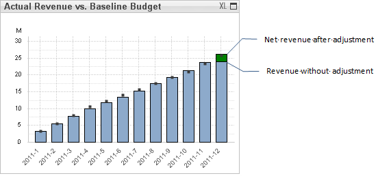
Position the mouse pointer over the bar to display the exact revenue adjustment amount and net revenue amount in a data box.
Note: If Costpoint Analytics is configured to include prior year adjustments, this is the only chart that breaks out prior year revenue adjustments separately. For all other charts and tables that display revenue, with one exception, the revenue amounts are the net revenue after adjustments. The exception is the Ad Hoc Data Discovery table. To display prior year revenue adjustment amounts in that table, select the Revenue Adjustment metric.
There are two ways to view revenue: Period and Year-To-Date (YTD). The type of chart impacts the data that displays on the charts.
Period is data for the current analysis period, while YTD provides a cumulative, rolling perspective within a given year. For example, February = January + February, March = January + February + March, and so on.
Profit defaults to YTD when used initially, but you can switch the chart type at any time.
To switch the type of chart...
Locate the chart type options. ![]()
Click Period or YTD. The selected option's button turns green, and the pertinent information on the charts and tables updates to reflect your selection.
The following options on the User Options tab affect this chart:
Budget Type
Org or Reorg
Organization View
For descriptions of how each option affects Revenue Analytics, see User Options That Affect Revenue.
Click ![]() at the top right of the chart
to display the chart at its maximum size. Click
at the top right of the chart
to display the chart at its maximum size. Click ![]() to restore the chart to its original size and location on the tab.
to restore the chart to its original size and location on the tab.
To focus the chart on a particular set of data points, click and drag the mouse pointer over the chart so that all of those data points are included in the green selection area.
To focus the chart on a more restricted analysis period, do either of the following:
Specify the analysis period using the analysis period bars at the top of the tab. ![]() Illustration
Illustration
Click and drag the mouse pointer over the chart so that the green selection area touches only the bars for the fiscal periods you want to include. ![]() Illustration
Illustration
To see the revenue amount and budget baseline or forecast as of a specific fiscal period, position the mouse pointer over bar for that period. When you do, Costpoint Analytics displays the amounts in a data box.
Click ![]() to send the data underlying
the chart to Microsoft Excel. More...
to send the data underlying
the chart to Microsoft Excel. More...
In addition to the actions described above, you can also do the following:
Print the chart.
Email the chart.
Export chart data to a CSV file.
Attach a note to the chart.
For more on these actions, see Print, Email, or Export Analytic Data and Attach Notes to Analytics.