
KPIs and Charts
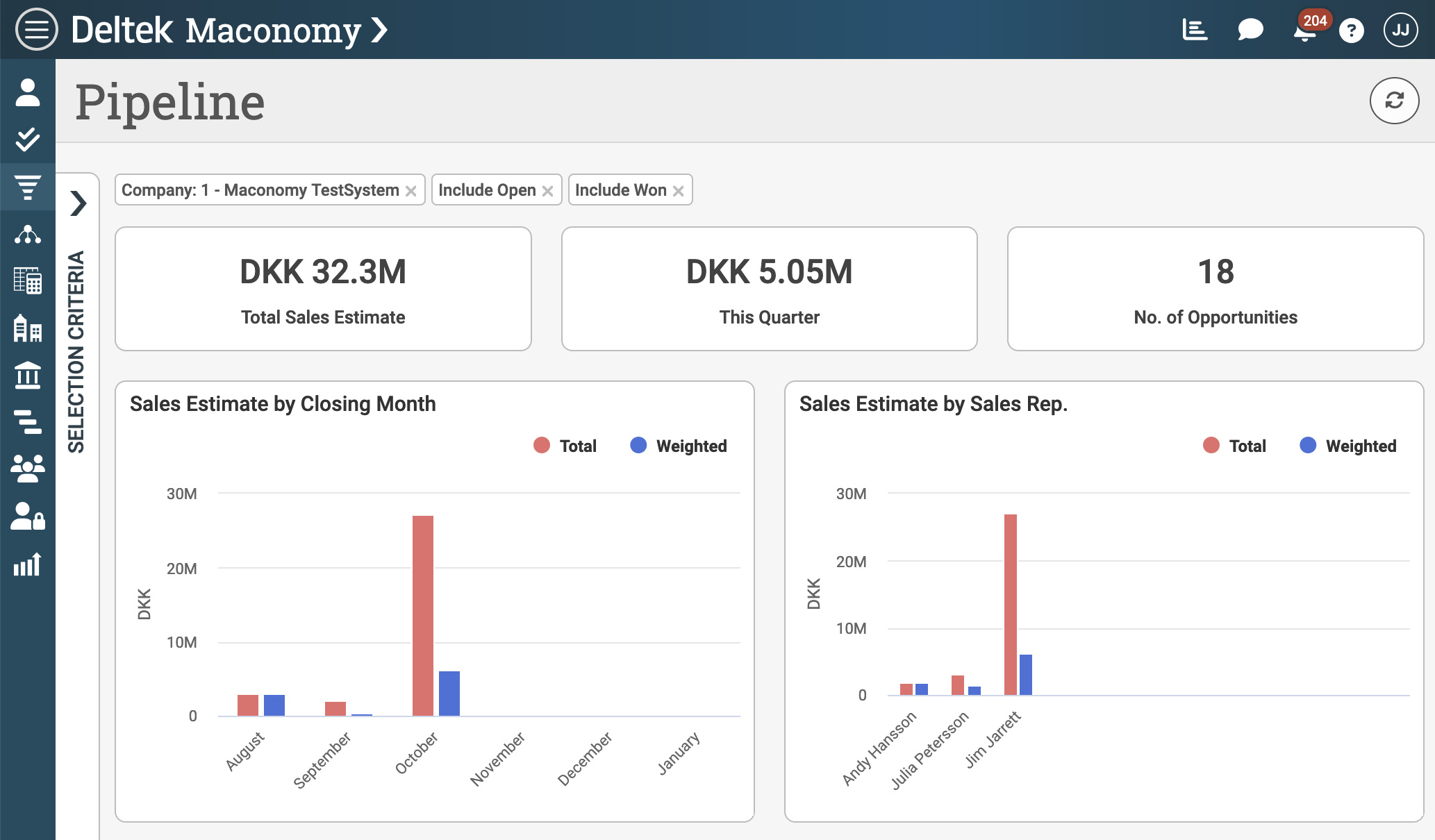
The Maconomy web client offers a variety of widgets to show important metrics, key performance indicators and trends across data points. The two main categories of widgets used for this purpose are: Key Performance Indicators (KPIs) and Charts. The screenshot of the Pipeline workspace in the CRM module below shows examples of both categories. Specifically, the Total Sales Estimate, This Quarter and No. of Opportunities boxes are examples of KPIs. The Sales Estimate by Closing Month and Sales Estimate by Sales Rep. widgets are examples of charts. The article describes the API for each of these and provides a few examples of their use.
KPIs
Key Performance Indicators (KPIs) are the simplest kind of visualization. A KPI is used to render a single data point along with a meaningful title. KPIs support dynamic styling through the use of background and foreground color. This facility can be used to simply highlight a certain metric or to distinguish between success and failure for a particular set of data based on criteria defined in the layout. The KPI object supports a pane-property to ensure that a specific data binding is in scope when using for instance unqualified field names.
Rows and Islands

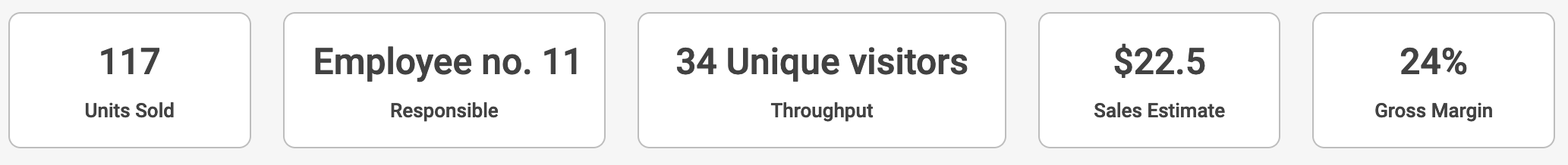
KPIs are technically a column type which means that they can be placed in an array of columns. The reason is that KPIs are often inserted in groups and laid out horisontally as a row as shown in the screenshot above. The JSON configuration required to achieve this can be seen in the following listing. To place KPIs on top of each other, they will need to be wrapped in separate columns-tags such that the web client can lay them out vertically.
"layout": {
  "rows": [
    {
      "columns": [
        {
          "T$title": "Units Sold",
          "kpi": {
            "value": "UnitsSold"
          }
        },
        {
          "T$title": "Units Returned",
          "kpi": {
            "value": "UnitsReturned"
          }
        }
      ]
    }
It is also possible to render KPIs inside islands. In this case, the KPIs are not shown as boxes, except if a different background color is chosen. There is an example of how this will look in the screenshot below.

Value Types
Technically, a KPI is a special rendering of an element from a card layout. The web client supports 5 different kinds of elements: fields, texts, unit fields, amount fields and percent fields. Similar to how these elements work in cards, they render a field value and optionally a unit. The 5 types are shown in the screenshot below and the following subsections shows how to configure each of them.
Field
The field value type renders the value of a single field.
{
  "T$title": "Units Sold",
  "kpi": {
    "value": "UnitsSold"
  }
}
Text
The text value type renders a string, possibly containing placeholders with dynamic expressions.
{
  "T$title": "Responsible",
  "kpi": {
    "value": {
      "text": "Employee no. ^{employeeNumber()}"
    }
  }
}
Unit Field
The unit field value type renders a field with a unit. The unit can either be a static string or the value of another field. Optionally, it is possible to control if the unit is pre- or postfixed.
{
  "T$title": "Throughput",
  "kpi": {
    "value": {
      "source": "NoOfVisitors",
      "unit": {
        "T$title": "Unique visitors"
      }
    }
  }
}
Amount Field
The amount field value type renders a field with a currency.
{
  "T$title": "Sales Estimate",
  "kpi": {
    "value": {
      "source": "TotalSalesEstimate",
      "currency": "BaseCurrency"
    }
  }
}
Percent Field
The percent field value type renders a field with a percent sign. This is a special case of the unit field value type.
{
  "T$title": "Gross Margin",
  "kpi": {
    "value": {
      "percent": "ShownPercGrossMarginTotalVar"
    }
  }
}
Sizing
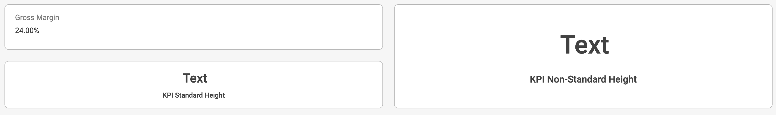
The size of a KPI can be partially controlled by setting an explicit height. In the screenshot above, the height has been increased to a non-standard value for the KPI on the right side. The height property is primarily used when displaying KPIs next to for instance cards or other layout elements with a different height than that of the standard KPI.
{
  "T$title": "KPI Non-Standard Height",
  "kpi": {
    "height": 150,
    "value": {
      "text": "Text"
    }
  }
}
The width of a KPI is on the other hand automatically determined based on the remaining content in the layout row. KPIs will take up as much horisontal space as possible. If multiple KPIs are placed in a row, they will divide the space equally unless the span-property is used.
Styling

KPIs can be styled using foreground and background colors as shown in the screenshot above. Colors are picked from the palettes typically defined in the Palettes.json file. The standard distribution of the web client comes with a set of palettes where appealing colors and color combinations have been defined. It is also possible to add custom palettes if required. The code listing below shows how the style-property is used to change the appearance of the second and third KPI. Notice in both cases, the color called Red is picked from the KpiTrafficLight-palette. The slight difference in the red color is caused by the background and foreground color using different RGB values in this palette.
{
  "T$title": "Red Background Color",
  "kpi": {
    "style": {
      "backgroundColor": "KpiTrafficLight.Red"
    },
    "value": { "text": "Text" }
  }
},
{
  "T$title": "Red Foreground Color",
  "kpi": {
    "style": {
      "color": "KpiTrafficLight.Red"
    },
    "value": { "text": "Text" }
  }
}
Styling of KPIs can be conditional to achieve a traffic light effect. One common approach is to use the firstMatch-construct which is also available in cards and tables. In the listing below, KPI will be green or red depending on the value of the field TotalSalesEstimate.
{
  "T$title": "Total Sales Estimate",
  "kpi": {
    "value": "TotalSalesEstimate",
    "style": {
      "firstMatch": [
        {
          "color": "Trafficlight.Green",
          "condition": "TotalSalesEstimate >= 20"
        },
        {
          "color": "Trafficlight.Red",
          "condition": "TotalSalesEstimate < 20"
        }
      ]
    }
  }
}
Formatting
The values shown in KPIs are usually used for summmary, high-level information. As such, it is often preferable to lower the precision as the KPI convey an indication or trend rather than an exact value. The web client offers various formatting options to acheive such an effect. The different data types support different kinds of formatting. The following sections lists these kinds.
Currency Display

KPIs showing amounts can either format the currency as a symbol or as the currency code. If nothing is specified, the KPI will follow the global formatting default for currency, usually symbol. The screenshot above illustrates how this is rendered. The following code listing shows how to use either default, code or symbol in the format-property of a KPI.
{
  "T$title": "Total Revenue (default currency display)",
  "kpi": {
    "value": { "source": "TotalRevenue", "currency": "BaseCurrency" }
  }
},
{
  "T$title": "Total Revenue ('code' currency display)",
  "kpi": {
    "format": {
      "currencyDisplay": "code"
    },
    "value": { "source": "TotalRevenue", "currency": "BaseCurrency" }
  }
},
{
  "T$title": "Total Revenue ('symbol' currency display)",
  "kpi": {
    "format": {
      "currencyDisplay": "symbol"
    },
    "value": { "source": "TotalRevenue", "currency": "BaseCurrency" }
  }
}
Short Format and Precision

KPIs displaying amount, integer and real values by default use short format with a precision of three digits. It is possible to turn off short formatting entirely or override the precision per KPI. The screenshot above illustrates the various possibilities and the code listing below shows how this effect is achieved.
{
      "T$title": "Total Revenue (default)",
      "kpi": {
        "value": { "source": "TotalRevenue", "currency": "BaseCurrency" }
      }
    },
    {
      "T$title": "Total Revenue (short = false)",
      "kpi": {
        "format": {
          "short": false
        },
        "value": { "source": "TotalRevenue", "currency": "BaseCurrency" }
      }
    },
    {
      "T$title": "Total Revenue (short = true)",
      "kpi": {
        "format": {
          "short": true
        },
        "value": { "source": "TotalRevenue", "currency": "BaseCurrency" }
      }
    },
    {
      "T$title": "Total Revenue (precision = 1)",
      "kpi": {
        "format": {
          "short": {
            "precision": 1
          }
        },
        "value": { "source": "TotalRevenue", "currency": "BaseCurrency" }
      }
    },
    {
      "T$title": "Total Revenue (precision = 5)",
      "kpi": {
        "format": {
          "short": {
            "precision": 5
          }
        },
        "value": { "source": "TotalRevenue", "currency": "BaseCurrency" }
      }
    }
  ]
}
Zero Suppression
KPIs showing values of the integer, real or time duration data types can be configured to either enable or disable zero suppression. Integers and reals are by default not zero suppressed, so here the configuration can be used to enable zero suppression. Time durations are, on the other hand, zero suppressed by default, so here the configuration option can be used to disable zero suppresion. The following listing shows how to disable zero suppresion for a time duration field.
{
  "T$title": "TimeDuration, disable zero suppression",
  "kpi": {
    "format": {
      "zeroSuppression": false
    },
    "value": "TimeDurationZero"
  }
}
Charts
Charts are more advanced graphical widgets than KPIs. Datawise, they cover a spectrum from showing a single value to rendering complex data series. Similar to KPIs, a chart is technically a column type and are therefore placed horisontally in layout rows, possibly next to other charts, KPIs and islands. In the following sections, we will list the different chart types along with examples of how to configure them.
Data Series
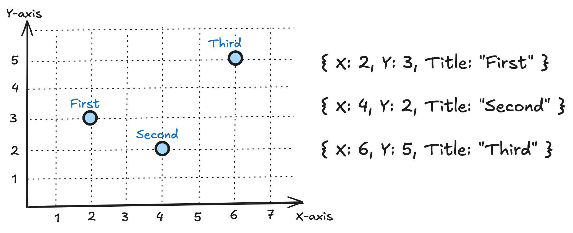
Before we delve into the actual chart types, it is necessary to briefly explain the concept of data series. All chart types in the web client rely on data series as the primary source of data. A data series is a set of data called chart series data. The chart series data is a tuple of a mandatory, numerical y-property, an optional, numerical x-property and an optional, textual title-property to name the data. The diagram below illustrates a simple data series with three named data points. If the x-property is not specified, it will be automatically calculated as starting from 0 and ending at the last data point along the x-axis.
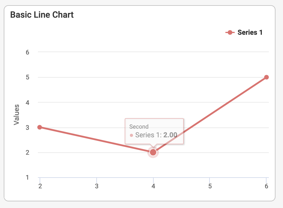
Let's imagine an example where the above data series represents employee growth of a company over time. The y-property would then be used for the number of employees. The x-property would represent the time the company has been in operation measured in years. The data points in the series represent the first, second and third tally of employees. We can define these data points as a hardcoded data series and use a chart to visualize them in the web client. Line charts are well-suited for showing how data evolves over time, so it is a good candidate for this visualization. The following code listing shows how this is achieved.
{
  "title": "Basic Line Chart",
  "chart": {
    "type": "line",
    "series": [
      {
        "data": {
          "x": ["2", "4", "6"],
          "y": ["3", "2", "5"],
          "title": [{ "template": "First" }, { "template": "Second" }, { "template": "Third" }]
        }
      }
    ]
  }
}
This produces a basic line chart as shown below. The chart has the three data points in the data series plotted in. The data points are connected by a line since the chart is configured to be of type line. The data series inherits this type. The title-property of each data point becomes visible when hovering the mouse over the point.
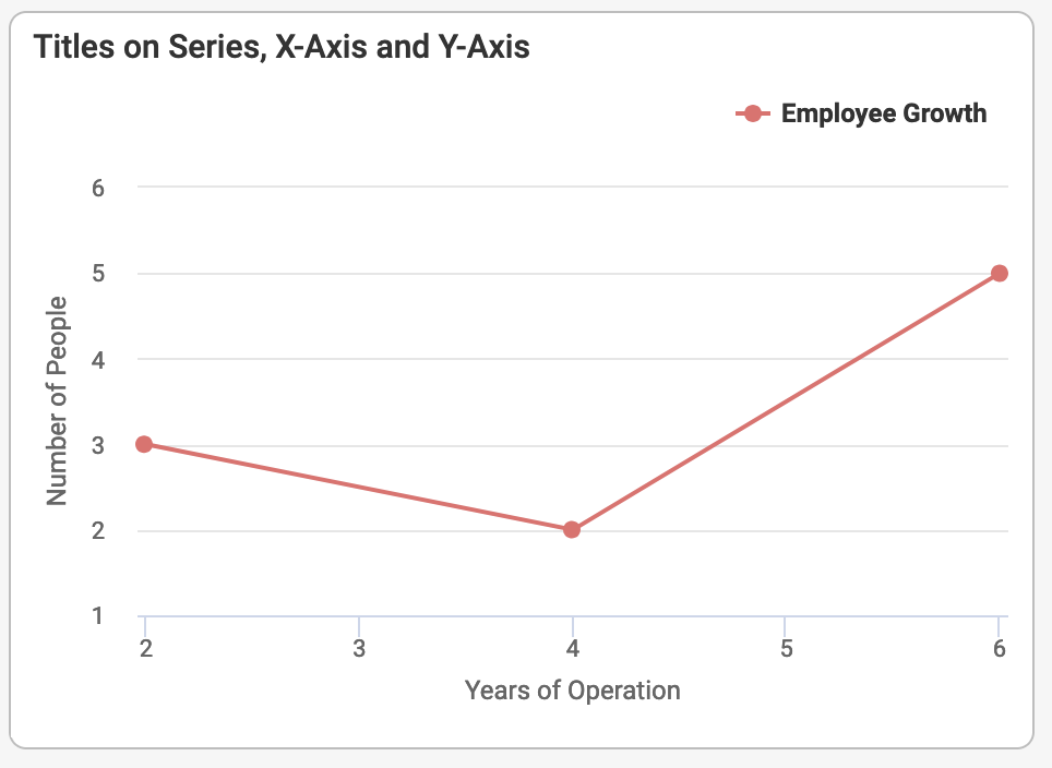
To enhance the readability of the chart, we can also add a title to the entire data series. in this case, we will use the title Employee Growth. To make the numbers on the X- and Y-axes more readable, we can also provide titles for these as shown in the listing below.
{
  "title": "Titles on Series, X-Axis and Y-Axis",
  "chart": {
    "type": "line",
    "xAxis": { "title": "Years of Operation" },
    "yAxis": { "title": "Number of People" },
    "series": [
      {
        "title": "Employee Growth",
        "data": {
          "x": ["2", "4", "6"],
          "y": ["3", "2", "5"],
          "title": [{ "template": "First" }, { "template": "Second" }, { "template": "Third" }]
        }
      }
    ]
  }
}
This produces a more readable chart as shown in the screenshot below.
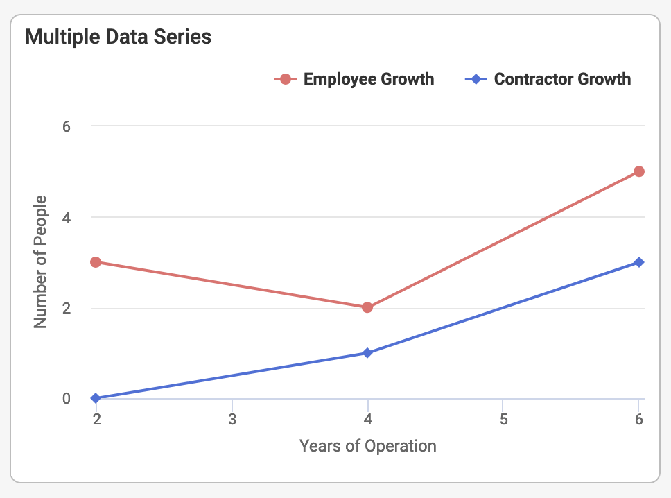
The observant reader will have noticed that the series-property on a chart object is actually an array. It is possible to show multiple, different data series in the same chart. We can even combine data series of different types such as line, column, bar and area in the same chart by adding a type-property on the individual data series. In our example, let's add another line data series showing the number of contractors hired by the company over the same time range. For simplicity, we will drop the title-property on each series. Adding the additional data series is specified in the following code listing.
{
  "title": "Multiple Data Series",
  "chart": {
    "type": "line",
    "xAxis": { "title": "Years of Operation" },
    "yAxis": { "title": "Number of People" },
    "series": [
      {
        "title": "Employee Growth",
        "data": {
          "x": ["2", "4", "6"],
          "y": ["3", "2", "5"]
        }
      },
      {
        "title": "Contractor Growth",
        "data": {
          "x": ["2", "4", "6"],
          "y": ["0", "1", "3"]
        }
      }
    ]
  }
}
The screenshot below illustrates the effect of combining multiple data series, in this case the trend of employees and contractors over time.
So far, our use of data series have been hardcoded data points for the x- and y-properties. The strings used in these arrays can also be expressions for a more dynamic effect. A more common way of supplying data for charts is, however, to use data providers rather than arrays of data points. A data provider is a data source that is based on a field from a container pane in the data bindings of the workspace. Typically, a table, filter or analyzer report is used as the backing container pane as these types provide a collection of concrete values or data points. The pane that acts as data provider generates one data point per record.
In the following code listing, we draw on information about employees and contractors from a custom container pane, HiringStatisticsTable, that has been made available in the data bindings. This pane exposes the fields required for our data points, specifically NumberOfEmployees, NumberOfContractors, TallyTitle and TallyYear.
{
  "title": "Hiring Statistics",
  "pane": "HiringStatisticsTable",
  "chart": {
    "type": "line",
    "xAxis": { "title": "Years of Operation" },
    "yAxis": { "title": "Number of People" },
    "series": [
      {
        "title": "Employee Growth",
        "data": {
          "y": { "value": "TallyYear" },
          "x": { "value": "NumberOfEmployees" },
          "title": { "value": "TallyTitle" }
        }
      },
      {
        "title": "Contractor Growth",
        "data": {
          "y": { "value": "TallyYear" },
          "x": { "value": "NumberOfContractors" },
          "title": { "value": "TallyTitle" }
        }
      }
    ]
  }
}
Notice that for both simple arrays of data points and full data providers, the data is supplied as strings. The underlying chart library takes care of the conversion to numerical format. As the x-, y- and title-properties support expressions, it is also possible to perform some formatting of data using the format-function (API) in the web client expression language.
Choosing the Right Chart Type
The web client charts are primarily based on a 3rd party chart library called HighCharts. The underlying library has a wealth of configuration options and variations. Our configuration API re-exposes a subset of these based on what we consider valid use cases in a Maconomy context. If you find something in the HighCharts API that you need, please report it to Maconomy Product Management so we can consider including it in a future release.
Choosing the right chart type can be difficult but the library does offer some guidance reference. The steps are as follows: First, determine what kind of data that should be visualized? Is it a continuous, e.g., a list of sales numbers, or categorical, e.g., a group of organizational departments. Second, what is the objective of the chart? Should it be used for visualizing comparison, composition, distribution, flow, relationship or trend. When these two questions have been answered, you can narrow the search to the right element(s) in the table below.
| Chart | Data Type | Objective(s) |
|---|---|---|
| Line | Continuous | Comparison, Flow, Relationship, Trend |
| Bar | Categorical | Comparison, Distribution, Trend |
| Column | Categorical | Comparison |
| Area | Continuous | Distribution |
| Pie | Categorical | Comparison, Composition |
| Bar With Negative Series | Categorical | Comparison, Distribution, Trend |
| Pyramid | Categorical | Composition, Flow |
| Funnel | Categorical | Composition, Flow |
| Solid Gauge | Continuous | Comparison |
In the following sections, the current list of supported chart types and configuration options is explained.
Line Chart
A line chart renders one or more data series by connecting the data points with a line. The most common use is to render values on the y-axis and a progression of time on the x-axis. This can be used to identify general trends as well as correlations within a data set.
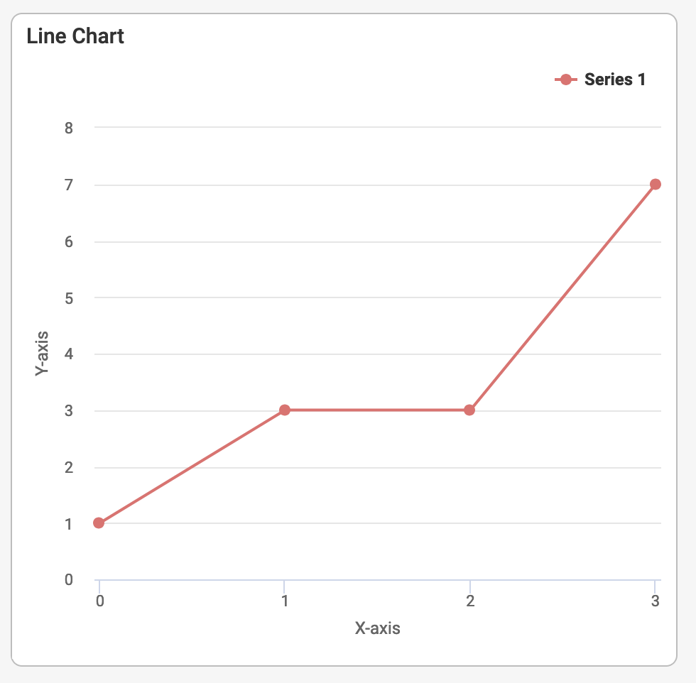
The screenshot above illustrates a simple, generic line chart. The following listing shows how to setup such a chart with line as the type. The data is in this case hardcoded as a data series with a collection of y-values. The x-values are undefined and will therefore be automatically generated as a sequence starting from 0. The xAxis- and yAxis-properties are optional but they are usually defined to make the line chart easier to understand.
{
  "T$title": "Line Chart",
  "chart": {
    "type": "line",
    "xAxis": { "T$title": "X-axis" },
    "yAxis": { "T$title": "Y-axis" },
    "series": [
      {
        "data": {
          "y": ["1", "3", "3", "7"]
        }
      }
    ]
  }
}
On a more abstract level, the line chart schema can be expressed as shown in the listing below. Notice that several properties are optional and should only be specified if the default setting is not sufficient for the use case.
{
  "title": "Line Chart",
  "chart": {
    "type": "line",
    "xAxis": // optional axis definition for the x-axis
    "yAxis": // optional axis definition for the y-axis
    "series": // array of one or more data series
    "palette": // optional reference to a custom palette for the chart
    "legend": // optional configuration of the chart legend
  }
}
The xAxis- and yAxis-properties are both examples of an axis definition. This definition is described in the following section as definitions of axes are similar across different chart types. The palette- and legend-properties are also applicable across different chart types and are therefore described in the Chart Colors and Palette and the Chart Legend sections.
Axis Definition
The axis definition is used to specify the axes for both x- and y-axis. It is possible to specify up to two axes on both dimensions. This is used when multiple data series are shown in the same chart. Each axis has a type-property which is one of the following: linear, logarithmic, datetime or categories. Linear is scale is the default and it starts at 0 and ends at the last data point in the data series. The logarithmic scale is based on powers, so the interval will follow patterns such as 1, 10, 100 etc until it covers the last data point. These scales do not support negative numbers. The datetime axis is based date intervals that are computed such that the whole data series can be shown. The category axis type is used for non-continuous axes. This can for instance be used to show employee types, departments, countries or other non-numerical data. Finally, the opposite-property is used to render the axis in the opposite side of where it is normally placed.
An axis definition has the following abstract specification.
{
  "type": // optional axis type, defaults to 'linear'
  "title": // optional title on the axis
  "categories": // optional categories  provided as data points
  "opposite": // optionally, show the axis in the opposite side
}
Chart Colors and Palette
The charts in the web client use a built-in palette of colors. It is possible to override this palette, if a specific set of colors or a specific order of the palette items. Color palettes are defined in the Palettes.json-file. The listing below shows how a palette, called MyChartColors, with 5 custom colors is defined. Colors are specified in the 6-digit RGB hexadecimal notation. The layout author can choose any number of colors but ideally the number should be equal to or greater than the number of data points in the data series rendered.
"MyChartColors": {
  "C1": "#E76D6D",
  "C2": "#4871DB",
  "C3": "#F1CA41",
  "C4": "#7FBB1B",
  "C5": "#9148DB"
}
To use this new palette in for instance the previously defined line chart, we need the following configuration.
{
  "T$title": "Line Chart",
  "chart": {
    "type": "line",
    "xAxis": { "T$title": "X-axis" },
    "yAxis": { "T$title": "Y-axis" },
    "series": [ ... ],
    "palette": "MyChartColors" // Custom palette referenced from here
  }
}
Chart Legend
The chart legend displays the names of the series shown in the chart.
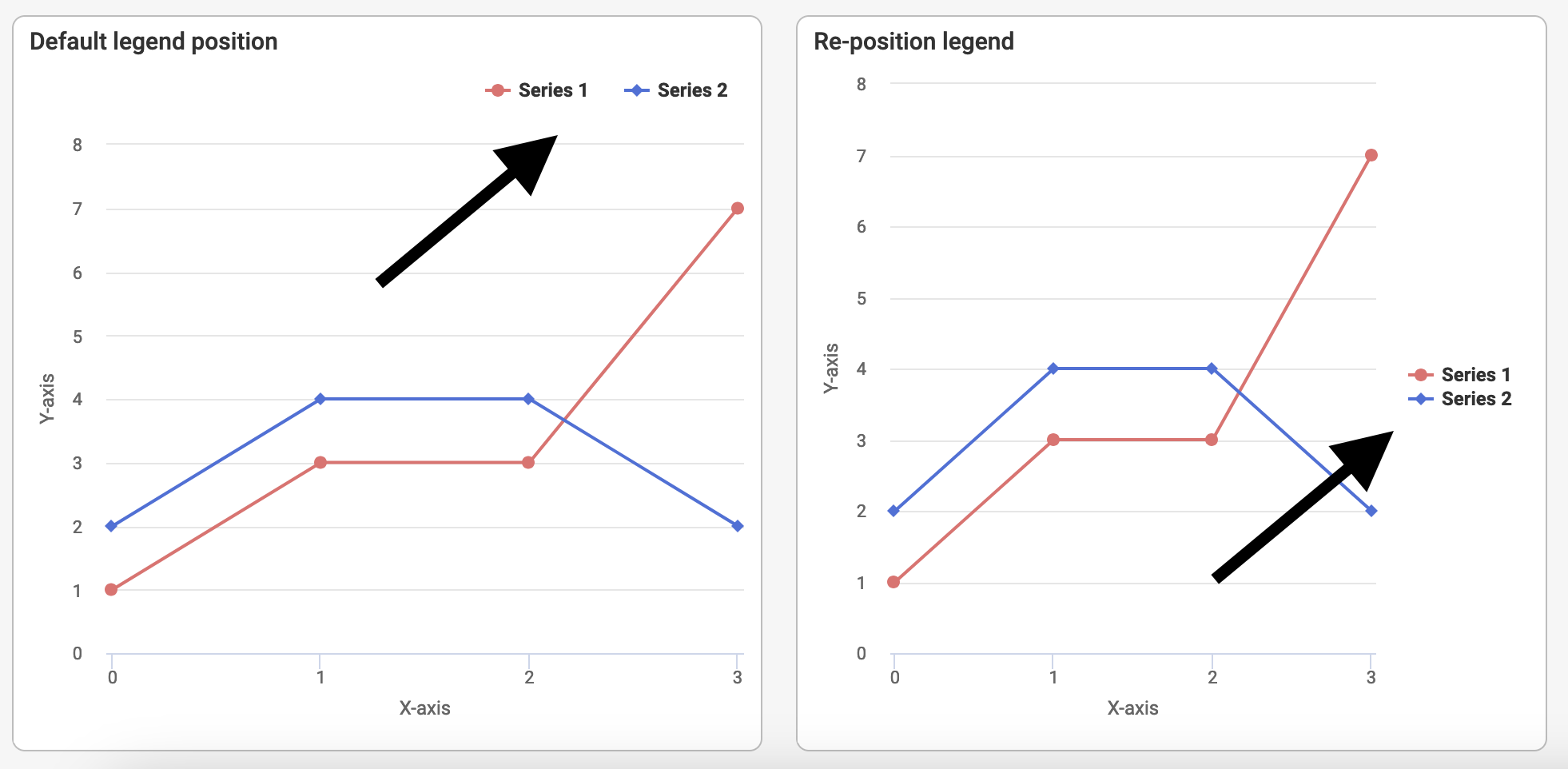
There are a few configuration options for repositioning the legend of a chart. In the screenshot above, there is an example of the legend in the default position and another where the legend has been repositioned. Specifically, the repositioning in this case consists of three steps: First, placing the legend items as a vertical list. Second, aligning the legend to the right of the chart. Third, ensuring that the vertical alignment of the legend is in the middle. The repositioning is achieved with the following configuration.
{
  "T$title": "Re-position legend",
  "chart": {
    "type": "line",
    "xAxis": { "T$title": "X-axis" },
    "yAxis": { "T$title": "Y-axis" },
    "series": [{ "data": { "y": ["1", "3", "3", "7"] } }, { "data": { "y": ["2", "4", "4", "2"] } }],
    "legend": {
      "layout": "vertical",
      "align": "right",
      "verticalAlign": "middle"
    }
  }
}
An legend definition has the following optional, abstract specification.
"legend": {
  "showInLegend": // used to show or hide the legend
  "layout": // 'vertical' | 'horizontal' | 'proximate';
  "align": // 'right' | 'left' | 'center';
  "verticalAlign": // 'middle' | 'top' | 'bottom';
  "itemMarginTop": // top margin in pixels
  "itemMarginBottom": // bottom margin in pixels
  "x": // negative or postive number pixels used to reposition on the horisontal axis
  "y": // negative or postive number pixels used to reposition on the vertical axis
}
Area Chart
The area chart is a variant of line charts where the area below the line is filled with color. If multiple data series are used, merged colors will be used to indicate if a data series is covered by another one. In the screenshot below, an example of a simple area chart is shown.
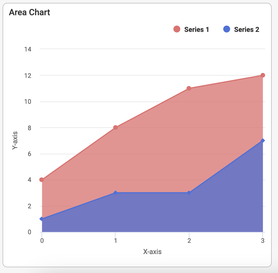
The configuration required to create such a chart is shown in the following listing.
{
  "T$title": "Area Chart",
  "chart": {
    "type": "area",
    "xAxis": { "T$title": "X-axis" },
    "yAxis": { "T$title": "Y-axis" },
    "series": [
      {
        "data": { "y": ["4", "8", "11", "12"] }
      },
      {
        "data": { "y": ["1", "3", "3", "7"] }
      }
    ]
  }
}
Bar and Column Chart
The bar and column chart types are almost identical, the only difference being that the x- and y-axes are switched. These charts are well-suited for comparisons, both between data points in a single series as well as between data points across different data series.
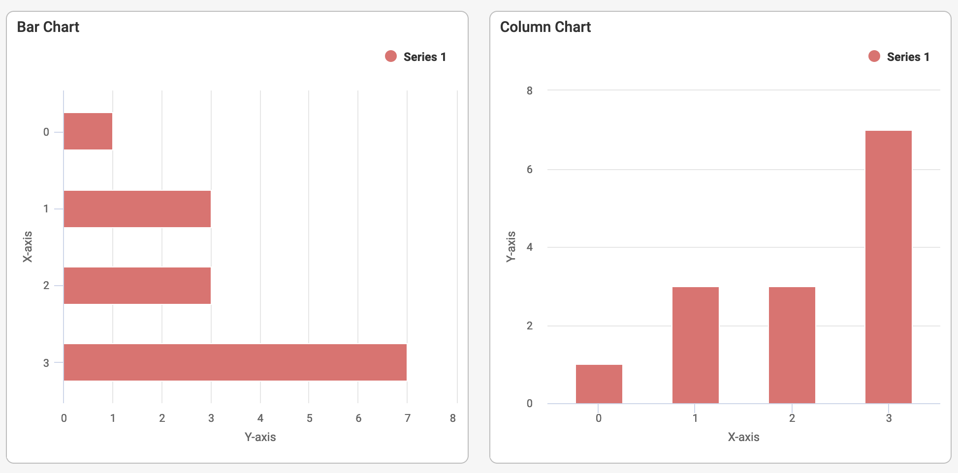
The screenshot above illustrates a simple, generic bar and column chart. The following listing shows how to setup such a chart with bar as the type. Simply replace the value bar with column to switch from bar to column chart. The data is in this case hardcoded as a data series with a collection of y-values. The x-values are undefined and will therefore be automatically generated as a sequence starting from 0. The xAxis- and yAxis-properties are optional but they are usually defined to make the chart easier to understand.
{
  "T$title": "Bar Chart",
  "chart": {
    "type": "bar", // replace with 'column' for column charts
    "xAxis": { "T$title": "X-axis" },
    "yAxis": { "T$title": "Y-axis" },
    "series": [
      {
        "data": {
          "y": ["1", "3", "3", "7"]
        }
      }
    ]
  }
}
On a more abstract level, the bar and column chart schemas can be expressed as shown in the listing below. Notice that several properties are optional and should only be specified if the default setting is not sufficient for the use case.
{
  "title": "Bar/Column Chart",
  "chart": {
    "type": // mandatory type, either 'bar' or 'column',
    "xAxis": // optional axis definition for the x-axis
    "yAxis": // optional axis definition for the y-axis
    "series": // array of one or more data series
    "palette": // optional reference to a custom palette for the chart
    "legend": // optional configuration of the chart legend
  }
}
Stacking
Both area, bar, and column charts support stacking of values by using the stacking-property. If multiple data series are used, the data points will by default be rendered side by side. When stacking is enabled, the values will be rendered as stacks as shown in the two right-most charts in the screenshot below. Two variants of stacking exists: normal stacking where the values are simply stacked and percentstacking where the values are shown as fractions of a stack that takes up the width of the chart.
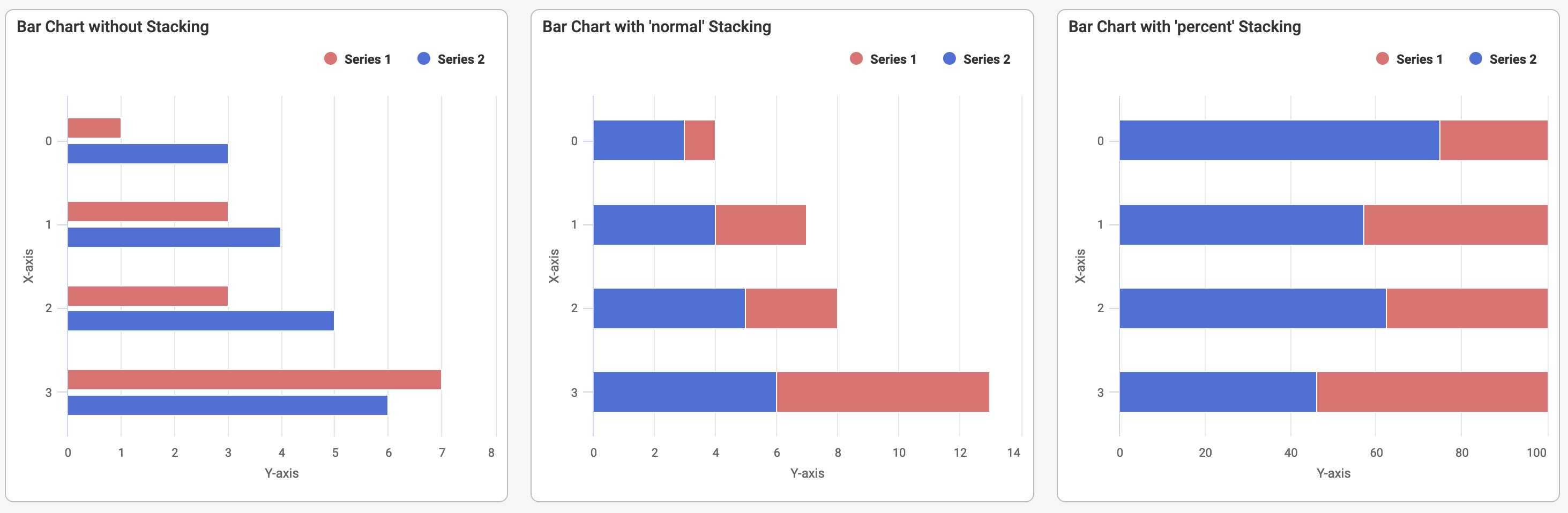
These effects are achieved with the following configuration.
{
  "T$title": "Bar Chart with 'normal' Stacking",
  "chart": {
    "type": "bar",
    "xAxis": { "T$title": "X-axis" },
    "yAxis": { "T$title": "Y-axis" },
    "stacking": "normal", // <-------------- normal stacking
    "series": [
      { "data": { "y": ["1", "3", "3", "7"] } },
      { "data": { "y": ["3", "4", "5", "6"] } }
    ]
  }
},
{
  "T$title": "Bar Chart with 'percent' Stacking",
  "chart": {
    "type": "bar",
    "xAxis": { "T$title": "X-axis" },
    "yAxis": { "T$title": "Y-axis" },
    "stacking": "percent", // <------------- percent stacking
    "series": [
      { "data": { "y": ["1", "3", "3", "7"] } },
      { "data": { "y": ["3", "4", "5", "6"] } }
    ]
  }
}
Bar Chart With Negative Series
A special variant of bar charts is the mirrored variant called bar-with-negative-series. This chart is useful for comparing y-values between two different data series. It is mandatory to supply to data series as the will be laid out on each side of a vertical splitter line. This is what gives the mirror-like effect.
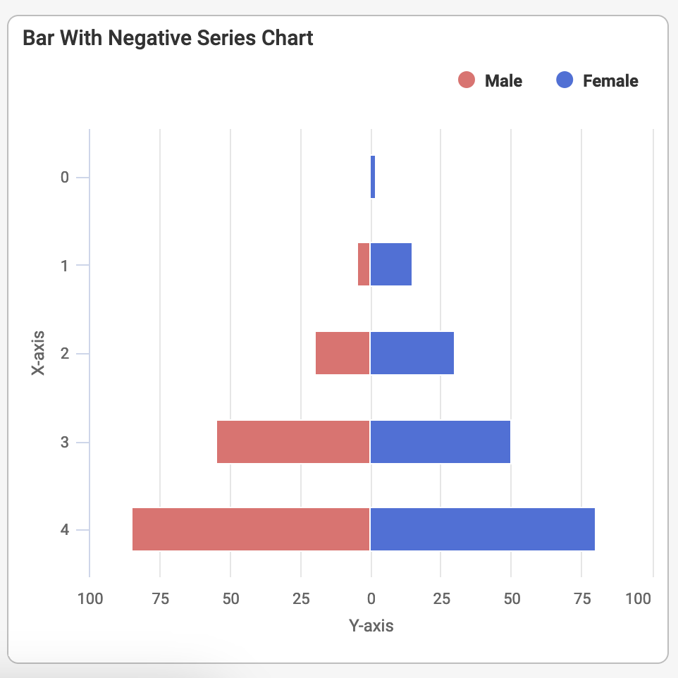
In the screenshot above, the chart could be used to compare for instance life expectancy or similar properties across two different populations. The configuration for this hypothetical example can be seen in the following listing.
{
  "T$title": "Bar With Negative Series Chart",
  "chart": {
    "type": "bar-with-negative-series",
    "xAxis": { "T$title": "X-axis" },
    "yAxis": { "T$title": "Y-axis" },
    "series": [
      {
        "T$title": "Male",
        "data": {
          "y": ["1", "5", "20", "55", "85"]
        }
      },
      {
        "T$title": "Female",
        "data": {
          "y": ["2", "15", "30", "50", "80"]
        }
      }
    ]
  }
}
Pie Chart
The pie chart is a circular chart divided into slices. Each slice is proportional to the quantity it represents. It is very useful for comparisons between parts and understanding the overall composition of a data series. It does not support axis definition and will usually only render a single data series. The screenshot below illustrates this chart type.
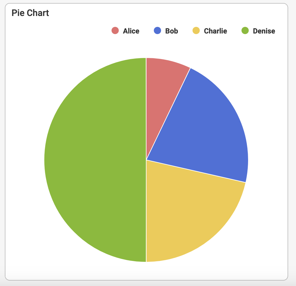
The following listing shows how to setup such a chart. Notice the use of pairs of y-value and title to make the chart as readable as possible.
{
  "T$title": "Pie Chart",
  "chart": {
    "type": "pie",
    "series": [
      {
        "data": {
          "y": ["1", "3", "3", "7"],
          "title": [
            { "T$template": "Alice" },
            { "T$template": "Bob" },
            { "T$template": "Charlie" },
            { "T$template": "Denise" }
          ]
        }
      }
    ]
  }
}
On a more abstract level, the pie chart schema can be expressed as shown in the listing below.
{
  "title": "Pie Chart",
  "chart": {
    "type": "pie",
    "series": // a single data series with y-value and title for each data point.
    "palette": // optional reference to a custom palette for the chart
    "legend": // optional configuration of the chart legend
  }
}
Funnel Chart
The funnel chart is used to visualize the stages of a flow or the segments in a pipeline. It does not support axis definition and only uses a single data series. The screenshot below illustrates this chart type.
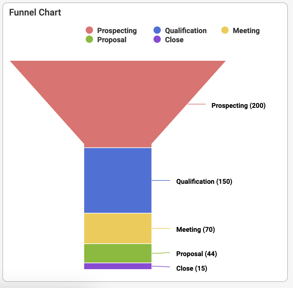
The following listing shows how to setup such a chart. Notice the use of pairs of y-value and title to make the chart as readable as possible. It is also possible to optionally redefine the default neck-property which determines the appearence of the funnel, specifically the lower part which is referred to as the neck.
{
  "T$title": "Funnel Chart",
  "chart": {
    "type": "funnel",
    "neck": {
      "width": 25,
      "height": 60
    },
    "series": [
      {
        "data": {
          "y": ["200", "150", "70", "44", "15"],
          "title": [
            { "T$template": "Prospecting" },
            { "T$template": "Qualification" },
            { "T$template": "Meeting" },
            { "T$template": "Proposal" },
            { "T$template": "Close" }
          ]
        }
      }
    ]
  }
}
On a more abstract level, the funnel chart schema can be expressed as shown in the listing below.
{
  "title": "Funnel Chart",
  "chart": {
    "type": "funnel",
    "series": // a single data series with y-value and title for each data point.
    "neck": { // optional definition of the appearance of the neck
      "width": // neck width in pixels
      "height": // neck height in pixels
    },
    "palette": // optional reference to a custom palette for the chart
    "legend": // optional configuration of the chart legend
  }
}
Pyramid Chart
The pyramid chart is a variant of the funnel chart. The main difference is that it is turned upside down and that it does not have a neck. The screenshot below illustrates how it looks.
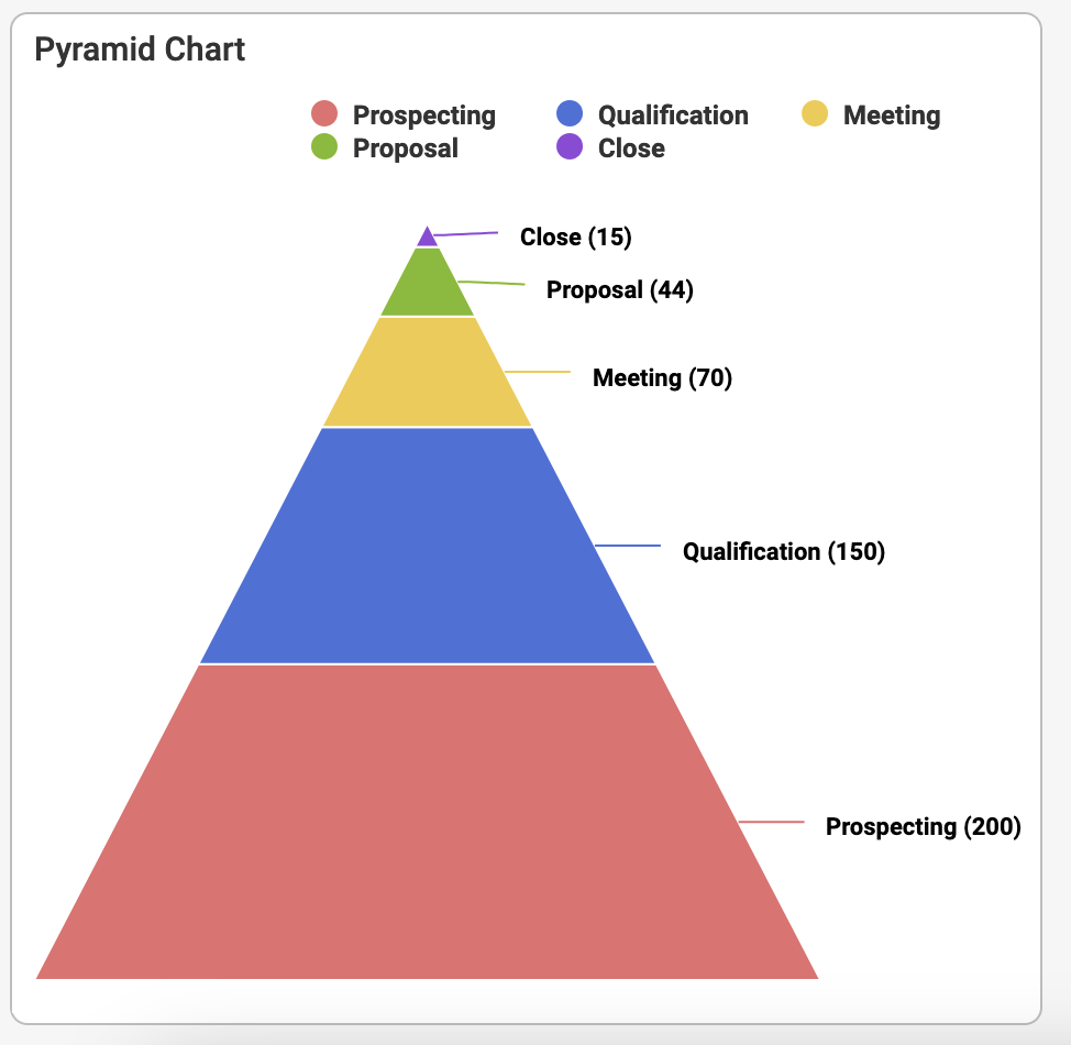
The following listing shows how to setup such a chart. Notice the use of pairs of y-value and title to make the chart as readable as possible.
{
  "T$title": "Pyramid Chart",
  "chart": {
    "type": "pyramid",
    "series": [
      {
        "data": {
          "y": ["200", "150", "70", "44", "15"],
          "title": [
            { "T$template": "Prospecting" },
            { "T$template": "Qualification" },
            { "T$template": "Meeting" },
            { "T$template": "Proposal" },
            { "T$template": "Close" }
          ]
        }
      }
    ]
  }
}
On a more abstract level, the funnel chart schema can be expressed as shown in the listing below.
{
  "title": "Pyramid Chart",
  "chart": {
    "type": "pyramid",
    "series": // a single data series with y-value and title for each data point.
    "palette": // optional reference to a custom palette for the chart
    "legend": // optional configuration of the chart legend
  }
}
Solid Gauge Chart
The solid gauge chart is used to render a single data point in a speedometer-like manner. Regions can be defined to facilitate a trafficlight effect. It supports y-axis definition and only uses a single data series. The screenshot below illustrates this chart type.
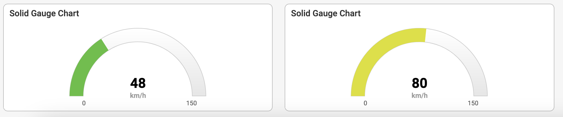
The following listing shows how to setup such a chart. Notice the use of pairs of y-value and title to make the chart as readable as possible.
{
  "T$title": "Solid Gauge Chart",
  "chart": {
    "type": "solidgauge",
    "regions": [
      { "start": 0, "end": 50, "color": "#55BF3B" },
      { "start": 51, "end": 100, "color": "#DDDF0D" },
      { "start": 101, "end": 150, "color": "#DF5353" }
    ],
    "range": { "min": 0, "max": 150 },
    "unit": "km/h",
    "series": [
      {
        "T$title": "Speed",
        "data": { "y": ["48"] }
      }
    ],
    "height": 150
  }
}
On a more abstract level, the solid gauge chart schema can be expressed as shown in the listing below.
{
  "title": "Solid Gaige Chart",
  "chart": {
    "type": "solidgauge",
    "palette": // optional reference to a custom palette for the chart
    "series": // a single data series with a single data point.
    "regions": { // an array of regions
      "start": // the interval start position of the region
      "end": // the interval end position of the region
      "color": // the color of the region
    }[],
    "range": { // optionally define the range for the chart
      "min": // the interval start for the entire chart
      "max": // the interval end for the entire chart
    },
    "unit": // optionally define a string used as unit for the value
    "size": // optional size hint for the chart. Either 'sm', 'md', or 'lg'
  }
}