Build a New Workspace
A workspace is the main mechanism for exposing Maconomy backend functionality to end-users. A workspace can leverage standard Maconomy containers, Analyzer reports, customer extensions, and third-party integrations through embedded web pages and reports.
This tutorial takes you through the process of building a new workspace in the web client. It focuses on a simple example based on standard Maconomy containers. Once you understand the basic principles, it should be straightforward to scale this to more complex cases and inplement customer-specific workflows.
Step 1: A Minimal Workspace
To build a simple Jobs workspace (that is, a minimal version with just enough syntax to get something running), the basic steps are:
- Create a workspace folder and main workspace file.
- Add the new workspace to the list of workspaces.
- Add the new workspace to a suitable location in the menu.
The entire web client configuration consists of JSON files that are found in the Web folder, subfoldered by version (for example: 5.3), on the Maconomy server. The following excerpt shows the standard file layout where all files are organized into the Platform, Shellor Workspace folders.
Web/
├─ 5.3/
│  ├─ Platform/
│  ├─ Shell/
│  │  ├─ Menu.json              <-- Menu
│  ├─ Workspace/
│  │  ├─ Extensions/
│  │  │  ├─ Extensions.json     <-- Extension workspaces
The excerpt highlights two important standard files, Menu.json and Extension.json, since these files will require content changes. Use the Maconomy Extender to make these content changes, add new files, and deploy the final result.
To build a simple Jobs workspace, you need to create a folder and a main file with the internal name of the workspace (in this case, SimpleJobs). By convention, you should place new workspaces in the Extensions folder to indicate that they are not simple customizations of existing, standard files. The following file layout illustrates the location of these additions:
Web/
├─ 5.3/
│  ├─ Platform/
│  ├─ Shell/
│  │  ├─ Menu.json
│  ├─ Workspace/
│  │  ├─ Extensions/
│  │  │  ├─ Extensions.json
│  │  │  ├─ SimpleJobs/            <-- Workspace folder
│  │  │  │  ├─ SimpleJobs.json     <-- Main workspace file
The SimpleJobs.jsonfile acts as the main file for the workspace. This file declares the internal name and external title of the workspace. It also defines the two main parts of any workspace:
- Data bindings - Specifies what data is available in the workspace and how different pieces of data are related and loaded.
- Layout - Specifies how data is rendered visually to the end-user and which interactions are possible in the workspace user interface.
The following code excerpt shows the absolute minimal code needed for the workspace to function. The minimal contents of the main workspace file are:
- An internal name
- An external title
- A data binding with at least one container, and
- An empty layout.
All container panes in the data bindings must have unique names so that you can reference them later on. This example used the name "JobsFilter". In addition, note the T$-prefix on the title property. This is a localization marker that ensures that the external title will be translated to the end-user's language (provided that a dictionary containing the term "Sinmple Jobs" is installed).
{
  "name": "SimpleJobs",
  "T$title": "Simple Jobs",
  "dataBindings": {
    "container": {
      "type": "filter",
      "name": "Jobsfilter",
      "source": "Jobs"
    }
  },
  "layout": {
    "rows": []
  }
}
To make the workspace appear in the web client, you need to add the workspace to the list of extension workspaces in the Extension.json file as shown in the following example:
{
  "workspaces": [
    {
      "$ref": "SimpleJobs:SimpleJobs"
    }
  ]
}
You also need to specify where it should be located in the menu by adding a reference to its internal name in the Menu.json file.
  ...
  {
    "T$title": "Jobs",
    "icon": "icon-mac-jobs",
    "items": [
      "SimpleJobs",
      ...
The result is a basic Hello World example, which is the best way to start creating workspaces in the web client.
Step 2: Data Bindings and $ref Macros
The newly created workspace shows jobs (also known as projects or engagements, depending on the industry). In this case, the data bindings are based on the filter pane from the Jobs container. For a minimal workspace, it is valid to have an empty layout. This means that no data will be loaded from the referenced Jobs container since nothing is shown in the user interface.
The workspace definition from Step 1 is obviously too simple to be of any practical use. To get to a more realistic stage, you need to add elements and refine the workspace specification. As workspace specifications can quickly grow, a central development tenet in the Maconomy web client is to split content across multiple files. Splitting into multiple files is made possible by a macro construct in the web client specification langugage called $ref. A $ref-reference tells the specification interpreter to substitute the JSON object that has the $ref property with the contents of another file.
{
  "name": "SimpleJobs",
  "T$title": "Simple Jobs",
  "dataBindings": {
    "$ref": "SimpleJobs_DataBindings"
  },
  "layout": {
    "rows": []
  }
}
In the previous excerpt, the $ref property has the value SimpleJobs_DataBindings. This tells the specification interpreter that the object that has the $ref property should be substituted with the contents of the SimpleJobs_DataBindings.json file. Since the entire object is substituted, you should never have additional properties in an object that already has a $ref property as these other properties would be lost as part of the macro expansion.
The contents of the SimpleJobs_DataBindings.json file are:
{
  "container": {
    "type": "filter",
    "name": "JobsFilter",
    "source": "Jobs"
  }
}
After the macro expansion, the contents that will display in the web client are:
{
  "name": "SimpleJobs",
  "T$title": "Simple Jobs",
  "dataBindings": {
    "container": {
      "type": "filter",
      "name": "Jobsfilter",
      "source": "Jobs"
    }
  },
  "layout": {
    "rows": []
  }
}
In summary, the $ref property and macro expansion allow the configuration author to split configuration content across multiple files. This results in smaller files and, ideally, a better separation of concerns.
Step 3: Heading
Most workspaces are rooted in a single container and specifically the filter pane from that container. In this example, the focus is on jobs so that acts as the main container. To allow the user to search for jobs and switch between different jobs, you need to add a heading. The heading definition specifies how to find records from the main container.
To support a heading with a search facility and navigation, you need to edit the data bindings so that it uses the search-filter pane type instead of a basic filter. A search-filter is a specific type of Maconomy filter panes that allows efficient search and facilitates the use of the given container as the root of a workspace. In the following code excerpt, the data bindings have been updated to use this specific pane type.
{
  "container": {
    "type": "search-filter",
    "name": "JobsFilter",
    "source": "Jobs",
    "parameters": {
      "JobNumber": {
        "urlParameter": "JobNumber"
      }
    }
  }
}
The previous code excerpt also includes the parameters property. This property is available on the root container in a set of data bindings. It specifies how the URL or address for this workspace should work. Specifically, in the previous example, the JobNumber parameter is declared and tied to the JobNumber field from the Jobs container. This allows the web client to indicate the currently selected job by showing its unique job number in the URL. It also allows external parties to link to this workspace and to a specific record by using a URL that follows the following form: https:\\<web-client-host>:<web-client-port>\workspace\simplejobs?JobNumber=<a-job-number>.
In the main workspace file, SimpleJobs.json, you can now add a heading and reference the updated data bindings to produce a search field at the top of the workspace user interface. By convention, the heading definition is added using a separate file called SimpleJobs_Heading.json. This file is included via a $ref property as shown in the following excerpt:
{
  "name": "SimpleJobs",
  "T$title": "Simple Jobs",
  "dataBindings": {
    "$ref": "SimpleJobs_DataBindings"
  },
  "layout": {
    "heading": {
      "$ref": "SimpleJobs_Heading"
    },
    "rows": []
  }
}
The defintion of the heading is specified in the SimpleJobs_Heading.json file, as shown in the following excerpt. The central navigation property states that this definition is used to navigate the workspace data. It is of the filter type which means the end-user can search and filter through records from the underlying data source. Alternative types are no navigation (as in the standard Favorites workspace) or calendar (as in the standard Weekly Time Sheets workspace). The filter-navigation is based on the JobsFilter pane which is the search-filter pane declared in the data bindings. Headings with filter-navigation must be based on container panes of search-filter type.
{
  "navigation": {
    "type": "filter",
    "pane": "JobsFilter",
    "T$shadowTitle": "Search for Jobs",
    "query": {
      "select": ["JobNumber", "JobName", "Name1", "ProjectManagerName"],
      "where": ["JobNumber", "JobName", "Name1", "ProjectManagerName"]
    },
    "selection": {
      "default": "MyJobs",
      "options": {
        "MyJobs": {
          "T$title": "My Jobs",
          "restriction": "ProjectManagerNumber = employeeNumber() and not Template"
        },
        "All": {
          "T$title": "All Jobs",
          "restriction": "not Template"
        }
      }
    }
  }
}
The shadowTitle property specifies the placeholder text shown in the search field by default. This is used to indicate to the end-user what the search represents (in this case, a search for records from the Jobs container).
The actual search definition is specified in the query property. A query has two parts:
- The
selectproperty describes which fields should be used to render search results in the search dropdown. In the previous example, each search result will be shown using its job number, job name, customer name (Name1), and project manager name. - The
whereproperty specifies how input in the search field should be used to restrict the search results. If multiple fields are specified (as in the example), then an entered search term will be matched against all the given fields. This kind of search is known as cross-column search.
Finally, the selection property specifies a number of predefined search restrictions. This is an optional property but it is widely used to allow some meaningful, predefined restrictions on the main data for the workspace. The previous code excerpt includes two predefined restrictions:
- "My Jobs" (The non-template jobs for which the logged-in employee is the project manager)
- "All Jobs" (All, non-template jobs) In the example, the
defaultproperty is used to specify that "My Jobs" is the default restriction when the end-user opens this workspace.
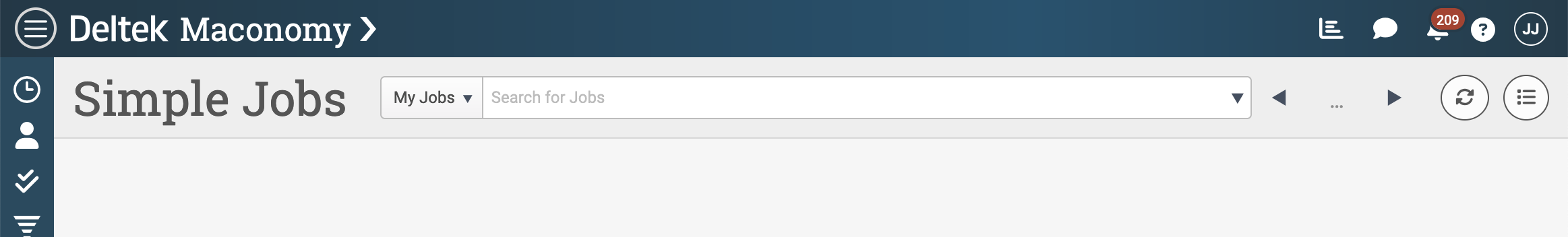
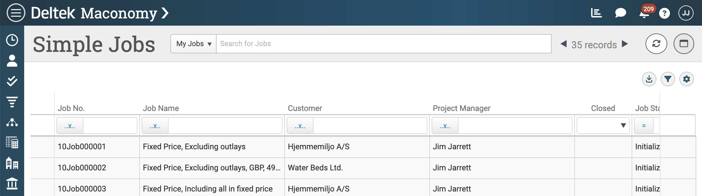
The previous screenshot shows how the heading is rendered in the user interface once added to the configuration. Note that when a heading is added to the configuration, the web client offers an auto-generated list view represented by the icon with three dots followed by horizontal lines. The following section details how you can customize this list view.
Step 4: List View
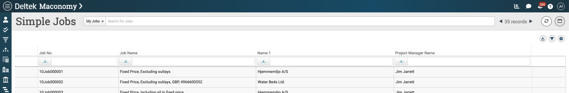
Workspaces that are based on a search-filter pane at the top of their data bindings can optionally provide a list view. The list view renders the search-filter in an expanded way such that all columns are visible and allows the end-user to perform both single-column and cross-column searches. As previously mentioned, a default list view is generated if the workspace author does not override this. The auto-generated list view is based on the fields specified in the select-clause in the navigation part of the heading. The following screenshot shows the default list view based on what has been specified thus far:
In the main workspace file, you can override the default and turn the list view completely off. To do this, add the listproperty and set its value to false.
{
  "name": "SimpleJobs",
  "T$title": "Simple Jobs",
  "dataBindings": {
    "$ref": "SimpleJobs_DataBindings"
  },
  "layout": {
    "heading": {
      "$ref": "SimpleJobs_Heading"
    },
    "list": false,
    "rows": []
  }
}
A more common scenario is to keep the list view but customize its columns. To do this, you need to add a layout file for the list view and reference that from the list property in your main workspace file.
{
  "name": "SimpleJobs",
  "T$title": "Simple Jobs",
  "dataBindings": {
    "$ref": "SimpleJobs_DataBindings"
  },
  "layout": {
    "heading": {
      "$ref": "SimpleJobs_Heading"
    },
    "list": {
      "$ref": "SimpleJobs_List"
    },
    "rows": []
  }
}
The SimpleJobs_list.json file specifies that the list view is based on your search filter. Use the pane property to make JobsFilter, the search-filter pane declared in the data bindings, available in this scope. The effect of using this property is that all field references in this scope will be resolved against this pane. In other words, rather than giving the fully qualified name for the Job Number field, JobsFilter.JobNumber (as an example), you can simply write JobNumber.
The most important property in the list view layout is columns which is an array listing all the fields you want to include in your layout. The following list includes seven fields from the Jobs Filter. The default title is overridden for two of them: Name1 and ProjectManagerName. Remember to prefix such titles with T$ to ensure that the overridden titles can be properly localized to the end-user's language.
{
  "pane": "JobsFilter",
  "columns": [
    "JobNumber",
    "JobName",
    {
      "field": {
        "source": "Name1",
        "T$title": "Customer"
      }
    },
    {
      "field": {
        "source": "ProjectManagerName",
        "T$title": "Project Manager"
      }
    },
    "Closed",
    "JobState",
    "InvoicingPrinciple"
  ]
}
The overridden list view layout results in the user interface shown in the following screenshot:
Step 5: Record
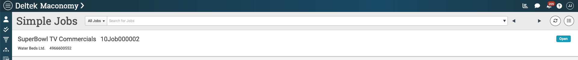
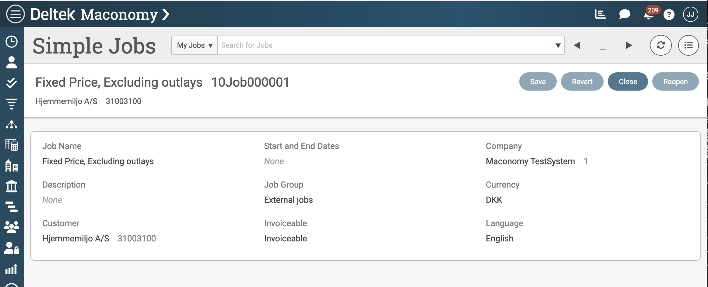
The search field navigation in the heading area or the list view allow the user to pick a record from the search-filter pane. It is also possible to navigate directly to a record by using URL parameters as mentioned in a previous section. Once a record has been chosen, the primary fields from that record can be shown in the next part of the layout known as the record area. In the following screenshot, the record area is shown with some primary information in the form of job name and number, customer name and number, as well as the overall workflow status of the job (that is, whether it is open or closed).
To produce this result, you need to extend the data bindings with a card pane. Since the record will show a selected job, you need to add the card pane from the Jobs container. To ensure that the card loads the correct record, you can bind the Jobs filter and card with a with binding as they belong to the same container. By convention, you should name the newly added card pane "JobsCard" to indicate that it is based on Jobs and is a card. This also makes it possible to distinguish it from the search-filter pane in the root of the data bindings.
{
  "container": {
    "type": "search-filter",
    "name": "JobsFilter",
    "source": "Jobs",
    "parameters": {
      "JobNumber": {
        "urlParameter": "JobNumber"
      }
    },
    "bindings": [
      {
        "binding": "with",
        "container": {
          "source": "Jobs",
          "type": "card",
          "name": "JobsCard"
        }
      }
    ]
  }
}
After updating the data bindings, you can start rendering the new data in the user interface. While in some some corner cases it is technically possible to use fields from the search-filter in the record area, it is generally not recommended. Workspace authors should always add additional panes to their data bindings to ensure that the data they want to show is loaded properly. Use the pane property to put the newly added pane in scope as shown in the following listing.
The leftmost part of the record area supports title and subTitle properties. These properties can display a single field-element, a foreign key using the reference-element, or a simple localized text string. The following listing uses the JobNumber_JobHeader and CustomerNumber_Customer foreign keys to render job name and number and customer name and number as title and subtitle.
{
  "pane": "JobsCard",
  "title": {
    "reference": {
      "foreignKey": "JobNumber_JobHeader"
    }
  },
  "subTitle": {
    "reference": {
      "foreignKey": "CustomerNumber_Customer"
    }
  },
  "status": {
    "source": "WorkflowStatusVar",
    "mask": {
      "open": {
        "T$title": "Open",
        "color": "WorkflowStatus.Open"
      },
      "closed": {
        "T$title": "Closed",
        "color": "WorkflowStatus.Closed"
      }
    }
  }
}
You can opt to add a status indicator to the right part of the record area. The status-element is a slightly more advanced element that offers a nice, colorful user interface indication. It is similar in nature to the switch/case-construct found in many programming languages. The source property determines which field is used as the status (in this case, the WorkflowStatusVar field). The mask property allows you to define a color and a title for one or more possible values of the status field. The values of the color property usually refers to a palette item defined in the global Palettes.json file.
Step 6: Actions
Actions allow the end-user to interact with the data shown in a workspace. There are generally two kinds of actions:
- workspace actions
- application actions
This section demonstrates how to add both kinds to your simple workspace.
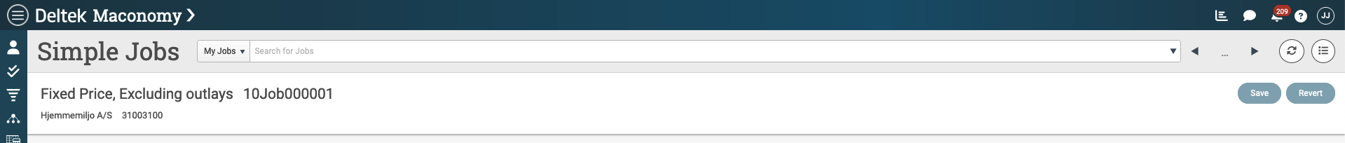
Workspace actions shown in the previous screenshot are the generic Save and Revert actions that allow basic updates to the workspace data. The Save action causes the web client to send all edited data to the server in an update request. The data is not saved until the server accepts the update. The Revert action substitutes all edited data in the user interface with the data originally received from the server. Revert is a client-side action that does not cause a network request to the server. In the previous screenshot, both of these actions are disabled as there is no edited data. In the main workspace file, the actionBar property is used to add actions. To add only the workspace actions, this property should equal an empty object as shown in the following listing:
{
  "name": "SimpleJobs",
  "T$title": "Simple Jobs",
  "dataBindings": {
    "$ref": "SimpleJobs_DataBindings"
  },
  "layout": {
    ...
    "actionBar": {},
    "rows": []
  }
}
When more actions - such as application actions - are required, the convention is to add these to a separate file that is referenced from the main workspace file.
{
  "name": "SimpleJobs",
  "T$title": "Simple Jobs",
  "dataBindings": {
    "$ref": "SimpleJobs_DataBindings"
  },
  "layout": {
    ...
    "actionBar": {
      "$ref": "SimpleJobs_ActionBar"
    },
    "rows": []
  }
}
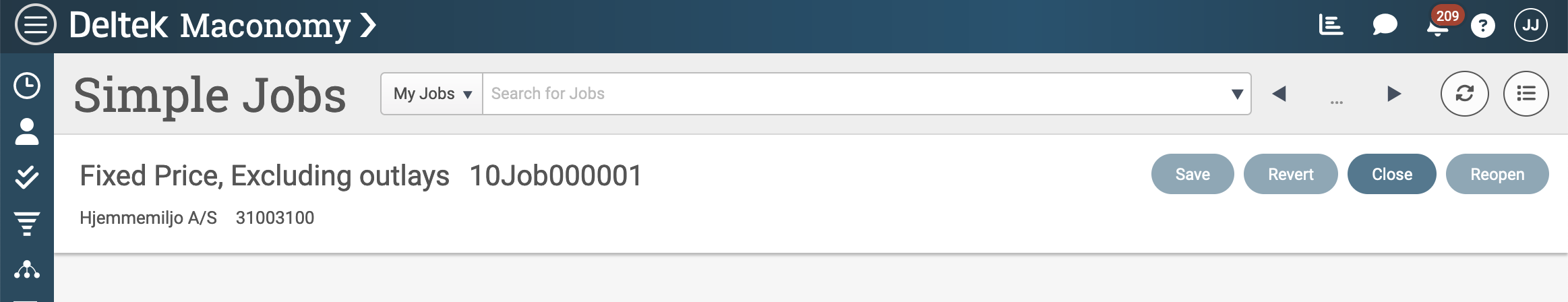
The contents of the SimpleJobs_ActionBar.json file is an object containing an array of actions or groups of actions. The example adds only the actions for opening and closing a job. Use the pane property to put the JobsCard pane containing these actions into scope. You can override the default titles of the actions that are included. Use the T$ prefix to ensure that proper localization occurs.
{
  "pane": "JobsCard",
  "actions": [
    {
      "T$title": "Close",
      "source": "CloseJob"
    },
    {
      "T$title": "Reopen",
      "source": "ReopenJob"
    }
  ]
}
The specification of an action bar results in actions appearing in the workspace as shown in the following screenshot. These actions are enabled or disabled depending on the state of the record received from the server. Note that if the end-user makes an edit (for example, changes the name of the job) and clicks the Close action, these will technically result in two server requests. First, the edit is saved and an updated record is returned. Second, the Close action is applied to the updated record.
Step 7: Form Layout
In the workspace user interface, the area below the heading and record contains the main layout known as the layout rows. These are an array of rows, possibly subdivided into columns, that contain the main data for the workspace. You can add different kinds of rows, each with a specific user interface. The following table lists the most frequently used ones and provides a short description of each:
| Row Type | Purpose |
|---|---|
| elements | A single column of elements (fields, intervals, and so on). |
| columns | Used to subdivide a row into logical columns. A column can show a KPI box, a chart, or a list of elements. |
| table | A table pane (that is, a pane containing multiple records) |
| tabs | Divides the layout below into one or more tabs. Each tab has a title and only one tab can be shown at a time. |
| grid | Renders a table or grid user interface based on individual values rather than a list of records. |
| embed | Embeds an external web page or document from a given URL. |
| alert | Shows an alert to highlight a message to the end-user. |
The sample Jobs workspace will stick with the traditional user interface for Maconomy containers and show a card and a table pane using layout rows. First, add the card layout. The card layout is defined in a separate SimpleJobs_Card_Row.json file, but you must add a reference to it in the main workspace file to ensure that it is loaded.
{
  "name": "SimpleJobs",
  "T$title": "Simple Jobs",
  "dataBindings": {
    "$ref": "SimpleJobs_DataBindings"
  },
  "layout": {
    ...
    "rows": [
      {
        "$ref": "SimpleJobs_Card_Row"
      }
    ]
  }
}
The convention in the web client is to show card data in three-column layouts. This means that the first row, the card row, needs to be subdivided into three columns, each showing a list of elements. The logical structure is shown in the following listing. Note that the example uses the pane property to ensure that the JobsCard pane is in scope in this layout. You can add fields from other panes as well, but they must be qualified by their proper pane name.
{
  "pane": "JobsCard",
  "columns": [
    {
      "elements": [
        ... (the first column)
      ]
    },
    {
      "elements": [
        ... (the second column)
      ]
    },
    {
      "elements": [
        ... (the third column)
      ]
    }
  ]
}
The actual card data is shown as layout elements. The simplest of these elements is the field element which simply shows the value of a single field from the underlying pane. The following two listings show how the job name field is added using a field element. In the left side, the full, verbose specification is shown. In the right side, the commonly used shorthand is shown. Shorthands are only applicable when no properties of the field, such as the title property, are overridden.
| Full version | Shorthand |
|---|---|
| |
The following table lists the most frequently used element types and their purpose.
| Element Type | Purpose |
|---|---|
| address | A compound element used to group address fields. |
| field | A single field. |
| interval | Two fields divided by a separator. |
| pair | Two fields shown next to each other. |
| link | A hyperlink or a workspace link. |
| reference | One or two fields belonging to a given foreign key. |
| status | A single field rendered using a mask. |
| text | A text string. |
| amount | A value and a currency field combined to render an amount. |
| unitField | A value and a unit field or static unit (for example: hours), combined. |
| percent | A single field rendered with a percent sign. |
| booleanGroup | A compound element used to group boolean fields. |
The example workspace will use a simple three-column layout with three elements in each column. To illustrate the different elements, the following listing combines both the full version and shorthand, as well as various element types:
{
  "pane": "JobsCard",
  "columns": [
    {
      "elements": [
        "JobName",
{
"field": {
"T$title": "Description",
"source": "Description1"
}
},
{
"reference": {
"foreignKey": "CustomerNumber_Customer"
}
}
]
},
{
"elements": [
{
"interval": {
"T$title": "Start and End Dates",
"from": "StartingDate",
"to": "ExpectedEndingDate"
}
},
"JobGroup",
"JobInvoiceableVar"
]
},
{
"elements": [
{
"reference": {
"foreignKey": "CompanyNumber_CompanyInformation"
}
},
"Currency",
"Language"
]
}
]
}
This configuration produces the following user interface. Note that when the fields are added to the layout, the web client takes care of binding each of them to the correct pane field and updating them automatically whenever new data is received from the server. Fields that support search will automatically have this capability enabled as well.
Step 8: Table Layout
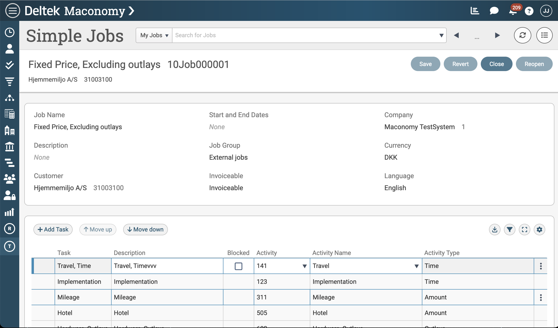
The next part of the workspace layout rows is the table row, which is used to render panes that can contain multiple records. Examples of such panes are filter panes, table panes, and Analyzer reports. This example will use the table row to render the tasks associated with a job. To load these tasks, you need to extend the data bindings with a primarybinding to the JobTasks container, as shown in the following listing. The example will load both the card and the with bound table from that container, but will only render the table part.
{
  "container": {
    "type": "search-filter",
    "name": "JobsFilter",
    "source": "Jobs",
    "parameters": {
      "JobNumber": {
        "urlParameter": "JobNumber"
      }
    },
    "bindings": [
      {
        "binding": "with",
        "container": {
          "source": "Jobs",
          "type": "card",
          "name": "JobsCard",
          "bindings": [
            {
              "binding": {
                "foreignKey": "primary"
              },
              "container": {
                "source": "JobTasks",
                "type": "card",
                "name": "JobTasksCard",
                "bindings": [
                  {
                    "binding": "with",
                    "container": {
                      "source": "JobTasks",
                      "type": "table",
                      "name": "JobTasksTable"
                    }
                  }
                ]
              }
            }
          ]
        }
      }
    ]
  }
}
To render the table, you need to add a SimpleJobs_Tasks_Table.json file and reference it from the rows property in the main workspace file.
{
  "name": "SimpleJobs",
  "T$title": "Simple Jobs",
  "dataBindings": {
    "$ref": "SimpleJobs_DataBindings"
  },
  "layout": {
    ...
    "rows": [
      {
        "$ref": "SimpleJobs_Card_Row"
      },
      {
        "$ref": "SimpleJobs_Tasks_Table"
      }
    ]
  }
}
The SimpleJobs_Tasks_Table.json file contains an object with a table property. This configuration specifies both the pane in scope as well as the columns and actions that should be shown from that pane. The columns array is similar to the one in the list view. This allows you to list a set of fields from the underlying table pane and optionally override certain properties such as the title property.
{
  "table": {
    "pane": "JobTasksTable",
    "columns": [
      {
        "field": {
          "T$title": "Task",
          "source": "TaskName"
        }
      },
      "Description",
      "Blocked",
      {
        "field": {
          "T$title": "Activity",
          "source": "ActivityNumber"
        }
      },
      "ActivityTextVar",
      "ActivityTypeCostTypeVar"
    ],
    "actions": ["Create", "Insert", "Delete"]
  }
}
One difference from the list view is that table rows allow the end-user to interact with the data shown. If the added columns are editable, the end-user can edit the value of individual cells. The actions property is an array of application actions that are listed when the user clicks the Row Tools icon found in the rightmost column of each table row (look for the vertical line of three dots). One exception is the Create action that is rendered as an Add Task action above the table (as shown in the following screenshot). Note the Move up and Move down actions shown next to Add Task action; these actions appear automatically if the underlying pane supports reordering of its records.
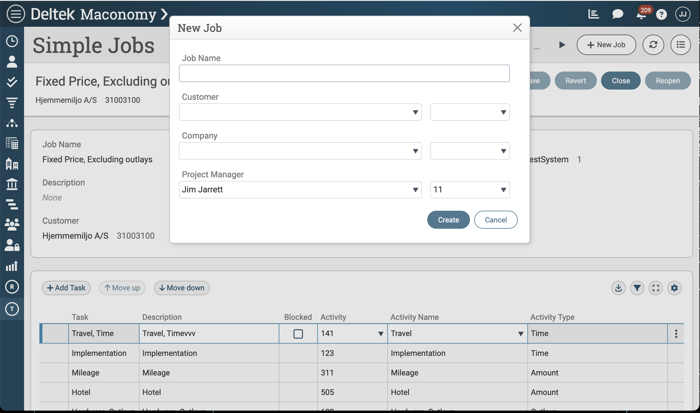
Step 9: Create Action and Wizard
The last part of the process is allowing the creation of new records (that is, jobs). By convention, you must specify the action in the heading configuration, and it is rendered as a dedicated button in the heading area. Although inline creation of records is technically possible, the convention and recommandation is to always use creation wizards. The listing below shows how to add the Create action to the SimpleJobs_Heading.json file and reference a separate Wizards:CreateJobWizard.json file. Wizard definitions are generally placed in a separate Wizards subfolder below the workspace folder.
{
  "navigation": {
    "type": "filter",
    ...
  },
  "createAction": {
    "pane": "JobsCard",
    "wizardWorkspace": {
      "$ref": "Wizards:CreateJobWizard"
    }
  }
}
In user interface terms, a wizard is a modal dialog that can be used to show additional data and/or run actions. In this case, you will design a wizard that first executes the init action against the server, provides a user interface for entering basic job data, and then performs the Create action against the server. This will effectively create a new record (that is, a new job) in the system.
The web client wizard is a powerful but also more complicated concept. Technically, it can be thought of as a separate workspace with its own data bindings and layout. When it is invoked by the end-user, it is attached to a pane in the host workspace and can read and update data as well as run actions from that host pane. In the previous listing, the wizard attaches to the JobsCard; this means that it can access data and actions from this pane.
The central properties of a wizard are:
- An internal name
- An external title
- An optional set of data bindings
- A workflow, and
- One or more page layouts
The following listing lays out the overall structure of the wizard. It does not have its own data bindings but declares a workflow with a start state and a main page layout. The start state uses the main page layout to render itself. The main page layout declares that the Host pane is in scope. Since the wizard is attached to the JobsCard pane of the host workspace, the name Host is in some sense an alias for JobsCard.
{
  "name": "CreateJobWizard",
  "T$title": "New Job",
  "workflow": {
    "start": {
      "pageLayout": "main",
      "transitions": {
        ...
      }
    }
  },
  "pageLayouts": {
    "main": {
      "pane": "Host",
      "rows": [
        ...
      ]
    }
  }
}
Wizards are abstract state machines that can have one or more states, each with a layout. Each state defines enter, exit and cancel transitions to describe what happens when the end-user moves between the different states. If you are familiar with the user interface concept of wizards, you can think of these states as similar to the pages in a user interface wizard. In the example, there is just one state, one page, and therefore only one layout.
The layout for a page in a wizard follows the same principle as for workspaces. It consists of a rows property that lists the layout rows that make up the user interface. The the following listing shows a simple elements layout that contains four elements with key pieces of data required for creating a job.
{
  "name": "CreateJobWizard",
  "T$title": "New Job",
  "workflow": {
    ...
  },
  "pageLayouts": {
    "main": {
      "pane": "Host",
      "rows": [
        {
          "elements": [
            "JobName",
            {
              "reference": {
                "foreignKey": "CustomerNumber_Customer"
              }
            },
            {
              "reference": {
                "foreignKey": "CompanyNumber_CompanyInformation"
              }
            },
            {
              "reference": {
                "foreignKey": "ProjectManagerNumber_Employee"
              }
            }
          ]
        }
      ]
    }
  }
}
You invoke the wizard by clicking the New Job action in the heading area of the host workspace. When that happens, the web client looks up the start state and runs the enter transition for that state. In this case, the enter transition executes the init action on the Host (JobsCard) pane. This initializes a new, unsaved record that is used to populate the fields in the layout. The start state also defines two outgoing transitions: a cancel transition to immediately stop the record creation and close the wizard, and an exit transition that performs the Create action against the server and thereby saves the new record in the system. The configuration of this workflow can be seen in the following listing:
{
  "name": "CreateJobWizard",
  "T$title": "New Job",
  "workflow": {
    "start": {
      "pageLayout": "main",
      "transitions": {
        "enter": [
          {
            "init": "Host"
          }
        ],
        "exit": [
          {
            "T$title": "Create",
            "actions": [
              {
                "create": "Host"
              }
            ]
          }
        ],
        "cancel": {
          "visible": true,
          "actions": [
            {
              "revert": "Host"
            }
          ]
        }
      }
    }
  },
  "pageLayouts": {
    ...
  }
}
As previously mentioned, wizards are a complex topic and will not be covered in further detail. However, this section provides a nice way to round off the new workspace. The Simple Jobs workspace now allows the end-user to find, edit, and add jobs in Maconomy. You can view the result, with the wizard in action, in the following screenshot: