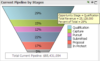
The Current Pipeline by Stages chart displays a breakdown of total current pipeline by stage. The height of each colored band represents the pipeline amount for opportunities currently at that stage. You can also display this data in a pie chart or block chart.
|
In this topic |
The default chart is a funnel chart, but you can use the Fast Change
icon (![]() ) in the chart title bar to display
a pie chart or a block chart.
) in the chart title bar to display
a pie chart or a block chart.
Chart Item |
Description |
Funnel chart layers |
Each colored layer in the funnel chart represents the contribution of the corresponding stage to the total pipeline. The height of each layer is proportional to that stage's portion of the total pipeline amount. |
Pie chart wedges |
Each colored segment in the pie chart represents the contribution of the corresponding stage to the total pipeline. The area of each segment is proportional to that stage's portion of the total pipeline amount. |
Block chart rectangles |
Each colored rectangle in the block chart represents the contribution of the corresponding stage to the total pipeline. The area of each block is proportional to that stage's portion of the total pipeline amount. |
Data Item |
Description |
Total pipeline amount |
The sum of unweighted or weighted pipeline amounts for all included opportunities. |
Stage pipeline amount |
The sum of unweighted or weighted pipeline amounts for opportunities currently assigned to that stage. |
Stage pipeline percentage |
(Stage pipeline amount ÷ Total pipeline amount) × 100 |
For descriptions of the sources of the chart data, see Data Sources.
If your firm has set up grouped stages for Capture Analytics, use the Detail and Grouped options to view pipeline data either for the original GovWin Capture Management opportunity stages (detail stages) or for the grouped stages. When you select the Grouped option, this chart displays pipeline percentages for the grouped stages.
A Capture Analytics configuration setting controls the sequence of stage layers in the funnel. Your system administrator sets that sequence during implementation of Capture Analytics.
When your firm implements Capture Analytics, it can select two amount fields from opportunity records in GovWin Capture Management to analyze as pipeline. The options under Pipeline Amount enable you to apply the analytics to either of those two amounts. When you select one of the options, Capture Analytics displays pipeline amounts calculated from amounts in that field in the opportunity records.
The Unweighted and Weighted options under Pipeline Probability Weighting provide the additional option to display either unweighted pipeline amounts or weighted pipeline amounts (pipeline amounts with the probabilities applied).
Capture Analytics calculates the weighted pipeline amount for each opportunity as follows: Unweighted pipeline amount × (Probability ÷ 100).
Click ![]() at the top right of the chart
to display the chart at its maximum size. Click
at the top right of the chart
to display the chart at its maximum size. Click ![]() to restore the chart to its original size and location on the tab.
to restore the chart to its original size and location on the tab.
To focus the chart on one or a few stages, do any of the following:
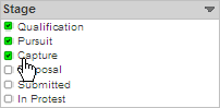
Select
the stages in the Stage
list. ![]() Illustration
Illustration
Click
and drag the mouse pointer over the chart so that the green selection
area touches only the stages you want. ![]() Illustration
Illustration
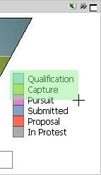
Click
and drag the mouse pointer over the chart legend so that the green
selection area touches only the stages you want. ![]() Illustration
Illustration
To focus the chart on a more restricted analysis period, specify the
analysis period using the analysis period bars at the top of the tab.
![]() Illustration
Illustration
If you use any of the above actions to change the chart, Capture Analytics applies the same changes, as appropriate, to all other analytic objects.
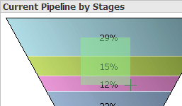
To see the pipeline data for a specific stage, position the mouse pointer
over that segment. When you do, Capture Analytics displays the stage name,
pipeline amount, and percentage of total pipeline in a data box. ![]() Illustration
Illustration
Click ![]() to send the data underlying
the chart to Microsoft Excel. More...
to send the data underlying
the chart to Microsoft Excel. More...
In addition to the actions described above, you can also do the following:
Print the chart.
Email the chart.
Export chart data to a CSV file.
Attach a note to the chart.
For more on these actions, see Print, Email, or Export Analytic Data and Attach Notes to Analytics.