Work with Charts and Tables
|

|
Click  in the title bar to display the chart or table at its maximum size, so that you can read it more easily. in the title bar to display the chart or table at its maximum size, so that you can read it more easily.
Click  to restore the chart or table to its original size and location on the tab. to restore the chart or table to its original size and location on the tab.
If the table or chart is grouped in a container object with one or more other tables or charts, maximize the entire container object.
|
In some cases, you can change the view from a chart to a table.
|

|
Click  in the title bar to change the view from a chart to a table. Click the same button to return to the original view. in the title bar to change the view from a chart to a table. Click the same button to return to the original view.
|
In some cases, you can narrow the focus of a chart by interacting with the chart itself.
|

____________________
|
If the chart has an interactive legend, you can select a subset of filter values in the legend.
-
Click the first value and hold down the left mouse button.
-
Drag the mouse pointer until the green selection area touches all of the values you are interested in.
-
Release the mouse button.
|
|

____________________
|
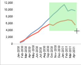
You can select a subset of the data points on a chart to focus on those data points.
-
Click at a spot that is above the highest vertical axis value you want and left of the first horizontal axis value, and hold down the left mouse button.
-
Drag the mouse pointer until the green selection area includes all of the data points you are interested in.
-
Release the mouse button.
|
|


____________________
|
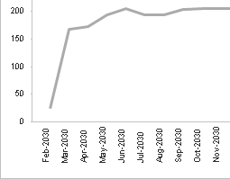
You can click a single line or bar in the chart to focus the chart on the data that line or bar represents.
Example: The first chart in this illustration has too many lines to present the data clearly. When you position the crosshair mouse pointer on one chart line and click, the chart redisplays to show only that line.
Note that the horizontal and vertical scales are also changed automatically to provide the most useful display of the selected chart line.
|
Focusing a chart in one of these ways actually changes the corresponding filter values. For example, if you select a subset of the fiscal periods along the horizontal axis, it changes the analysis period. As a result, focusing a chart changes not only that chart but all other analytic objects on the tab that are subject to the affected filter.
|


|
You can narrow the focus of a table by clicking cells in the table.
If you click a cell in a column that contains filter values, the table is filtered based on the selected value. If multiple rows have the selected value in that column, all of those rows are selected.
If you click a cell in a column that contains numeric data, the table is filtered for the combination of filter values in that row. Generally that focuses the table on that row only.
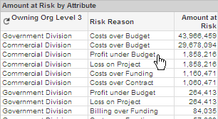
Example: If you click Profit under Budget in the Risk Reason column, as shown here, the table focuses on the two rows with Profit under Budget in that column.
To reverse the action and remove the filter, click the same cell again.
|
Focusing a table in this way actually changes the corresponding filter values. For example, if you select a specific organization in a table column, it changes the organization filter. As a result, focusing a table changes not only that table but all other analytic objects on the tab that are subject to the affected filter.
To sort a table based on the values in one of the columns, double-click the column heading for that column.
To change the sort order from ascending to descending or from descending to ascending, double-click the column heading of the current sort column.
To see the precise value represented by the intersection of a plotted line with the vertical grid line for a horizontal axis value, position the mouse pointer over the intersection point. Costpoint Analytics then displays the intersection value and related information in a data box.

It is much easier to position the mouse pointer over a data point if you first maximize the chart.
To see the precise value of a bar in a bar chart, position the mouse pointer anywhere on that bar. When you do, the bar value and related information display in a data box.
Because there is no equivalent to the mouse pointer, you cannot view data boxes when you work with the analytics on an iPad.
|


|
To expand a table item in a pivot table to reveal detail at the next level, click  in that table cell. in that table cell.
To collapse the detail for a table item, click  in that table cell. in that table cell.
To expand or collapse detail for all items in a column, right-click in that column, and click either Expand All or Collapse All on the shortcut menu.
|
|

|
Some analytics tabs contain more charts and tables than can be displayed at one time. In that case, multiple charts or tables share an area of the tab, and you switch between them using tabs for that area.
Example: In the Historical Pipeline tab, the Historical Pipeline Composition tables are displayed by default. To display the Movement Between Stages table instead, click the Movement Between Stages tab.
|
|

|
If a chart legend contains too many items to display the complete list, scroll arrows are displayed next to the legend.
Click  to scroll items into view that are lower on the legend. Click to scroll items into view that are lower on the legend. Click  to scroll to items that are higher on the list. to scroll to items that are higher on the list.
|

![]() in the title bar to display the chart or table at its maximum size, so that you can read it more easily.
in the title bar to display the chart or table at its maximum size, so that you can read it more easily.![]() to restore the chart or table to its original size and location on the tab.
to restore the chart or table to its original size and location on the tab.
