Comparing Different Risk Mitigation Scenarios
Use the Risk Register mitigation steps to set up and run risk analysis that compares different mitigation scenarios to see the impact on the project.
This displays in a Risk Exposure Comparison chart.
Example of a Risk Exposure Comparison Chart with Multiple Risk Mitigation Step Scenarios
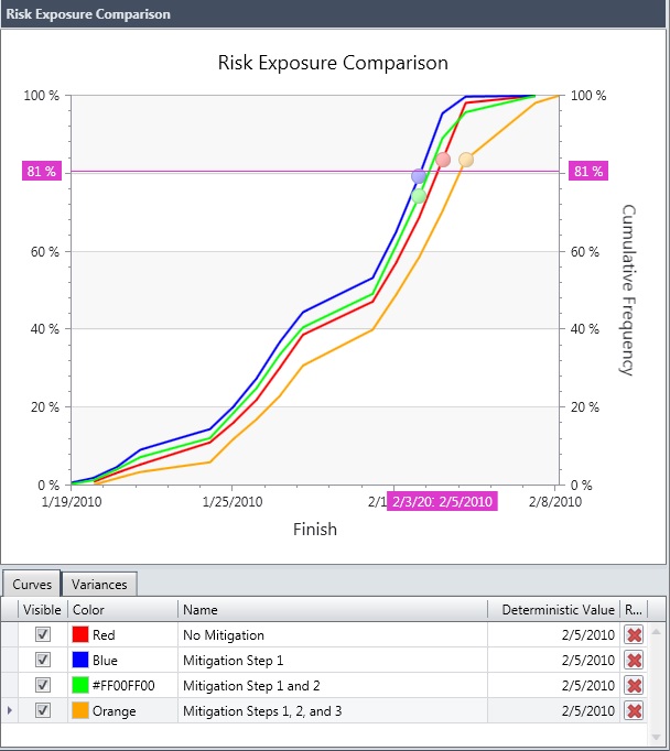
- The percentages indicate the probability of the activity finishing by the date you see in the x-axis. For example, in the green mitigation scenario above, until 4/24, the activity has a 40% probability of finishing. After that date, the probability starts to improve.
- You can relabel the mitigation steps by editing the Name column.
- Deselect the check box in the Visible column to remove the step from the chart.
- Click the X in the Remove column on the right side of the grid to remove the step data from the chart. If you want to re-add it, you will need to run Risk Analysis again with the same mitigation steps selected.