| Field | Description |
|---|
| Chart Title
|
Enter a title for the chart.
|
| Chart Labels
|
Select a type of label (for example, Label, Amount, Percent, or a combination of these). The choices vary depending on the chart type.
|
| X Axis Title
|
This coordinate appears only on column and bar charts. The default title for the X axis in this field is based on the first level of grouping on the report. You can change that default text. If you change the first level of grouping,
Vantagepoint updates
X Axis Title to match the new first level.
The only time that the first grouping level is not considered is when you add a slice for a pie chart. For example, if you group by project and select
Revenue for a slice, you get one slice for each project that has revenue. If you add a slice and select
Cost, you get one slice for total revenue and one slice for total cost.
|
| Y Axis Title
|
This coordinate appears only on column and bar charts. Enter a label for data listed on the Y axis. When you make selections in
Display Data,
Vantagepoint displays a default title, but you can change it.
|
| Slice By
|
This field appears only if you select a Pie or Doughnut chart. This field displays the first selected item on the Sorting/Grouping tab. That is the item used to "slice" the data selected in
Display Data. For example, if the first sorting/grouping item is
Project Number, each slice of the pie or doughnut chart represents the data for a project.
|
| Show
|
Select the location (first or last page) where you want the chart to appear on the report. To generate the report with the chart but without the columns of data, set the
Show option to
Chart Only. You can also display just the chart on your Dashboard.
|
| Show Legend
|
Select the location of the chart legend.
The legend provides a color key to all graphed items. Regardless of the number of graphed items and the height of the legend, all of the graphed items are displayed. This can result in an unreadable legend because the items overlap. To correct that situation, change the record selection criteria for the report to reduce the number of graphed items, increase the height that you specify for the chart, or specify a smaller font size for the chart.
|
| Font Size
|
Specify the font size for the chart.
Vantagepoint uses this font size for all text and amounts associated with the chart.
|
| Chart Height
|
Specify the height of the chart area in inches or millimeters based on which one you selected in the
Unit of Measure field on the Layout tab. If you use inches, use decimals for fractions of an inch (for example 3.50).
In the area defined by your entries in
Height and
Width,
Vantagepoint displays the chart itself, the chart title, and the legend.
|
| Chart Width
|
Specify the width of the chart area in inches or millimeters based on which one you selected in the
Unit of Measure field on the Layout tab. If you use inches, use decimals for fractions of an inch (for example 3.50).
In the area defined by your entries in
Chart Height and
Chart Width,
Vantagepoint displays the chart itself, the chart title, and the legend.
|
| Display Lines to Labels
|
Pie or doughnut charts only: Select this option to display a line that connects each slice to its label.
|
| Top Alignment
|
Specify the top margin in inches or millimeters based on which one you selected in the
Unit of Measure field on the Layout tab. If you use inches, enter decimals for fractions of an inch. For example, enter
1.5 for an inch and a half.
If you intend to display the chart on your Dashboard, we recommend that you set the
Top and
Left options to 0 (zero).
|
| Left Alignment
|
Specify the left margin in inches or millimeters based on which one you selected in the
Unit of Measure field on the Layout tab. If you use inches, enter decimals for fractions of an inch. For example, enter
1.5 for an inch and a half.
If you intend to display the graph on your Dashboard, we recommend that you set the
Top and
Left options to 0 (zero).
|
 to select a group from the drop-down list.
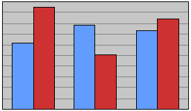
 ) if you want the chart to look like this...
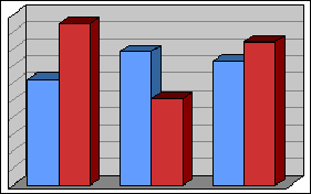
 ) if you want the chart to look like this: