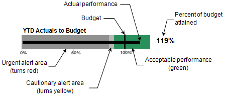
Each summary analytic area, with the exception of Projects at Risk, includes a bullet graph to give you a visual representation of the status of that performance indicator.

The following table lists the parts of a bullet graph.
Graph Item |
Description |
Horizontal bar (black) |
The black horizontal bar represents the actual performance for the analysis period (for example, year-to-date revenue). If you position the mouse pointer at any point on this bar, Costpoint Analytics – Summary displays the budget amount, the performance amount and percentage of budget at which the cautionary alert is triggered, and the performance amount and percentage of budget at which the urgent alert is triggered. |
Vertical bar (black) |
The black vertical bar represents the baseline budget or forecast for the analysis period (for example, year-to-date revenue budget). |
Percent attained |
The percentage to the right of the graph is the percentage of budget attained for the analysis period: (Actual performance / Budget) × 100. |
Percentage scale |
The scale along the bottom of the graph indicates percentage of budget. |
Alert areas |
The graph background is divided into alert areas based on tolerance percentages that your system administrator establishes for each of the analytics:
The width of the cautionary alert area depends on the tolerances your system administrator specifies. If the difference between the percentage at which the cautionary area begins and that at which the urgent area begins is small, the cautionary alert area will be very narrow. |
If all of the data that the graph requires has not been loaded into Costpoint Analytics, a message displays in place of the graph to alert you.