Utilization % Analysis Chart
|
Chart Item
|
Description
|
|
Horizontal axis: analysis period
|
The horizontal axis displays the fiscal periods included in the analysis period.
|
|
Vertical axis: current value
|
The vertical axis displays the current value for the utilization that you are viewing.
|
|
Data Item
|
Description
|
|
Bars: Direct/Available Hours or Costs
|
The chart displays the direct or available hours or cost utilization % for the analysis period.
Direct or available hours or costs % display for historical months as filled bars.
For descriptions of the sources of the data used in labor utilization, see Data Sources.
|
|
Baseline Budget or Forecast
|
The Budget will reflect either Baseline Budget or Forecast, depending on the Budget Type option (as found on the User Options tab), and will display as a black square on each bar on the chart.
|
|
Direct Target or Available Target
|
This displays the target value, as a line, above the respective bar.
|
There are two ways to view the type of labor used: Available
or Direct. These options
impact the Utilization % Analysis and the Utilization % Comparison charts.
Direct labor utilization is based on total labor, while available labor
utilization subtracts employee leave from the total labor. These options
ensure that you can track the efficiency of your labor force.
Labor type defaults to Direct
, but you can switch the type at any time.
To switch the type of labor...
Locate the labor type options.

Click Available or Direct. The selected option's button
turns green, and the pertinent information on the charts updates to
reflect your selection.
You can select different ways to view labor utilization: by Cost
or Hours, and by Period
or Year-to-Date (YTD).
Cost or Hours
Cost allows you to view
the total cost of labor utilization while hours only allows you to
view the number of hours charged. These options ensure that each employee
can only access the appropriate labor information.
Your security rights
determine access to select Cost
or Hours. Your system administrator
may configure your application to only allow Hours.
Contact your system administrator for further information.
Direct labor utilization
defaults to Hours when used
initially, but you can switch the chart type at any time.
Period or YTD
Period is data for the
current analysis period while YTD provides a cumulative, rolling perspective
within a given year. For example, February = January + February, March
= January + February + March, and so on.
Labor Utilization defaults
to YTD when used initially,
but you can switch the chart type at any time.
To switch the labor utilization view...
Locate the Utilization % Based
On options.

Click Cost or Hours. The selected option's button
turns green, and the pertinent information on the charts and tables
updates to reflect your selection.
Click Period or YTD. The selected option's button
turns green, and the pertinent information on the charts and tables
updates to reflect your selection.
Click  at the top right of the chart
to display the chart at its maximum size. Click
  to restore the chart to its original size and location on the tab.
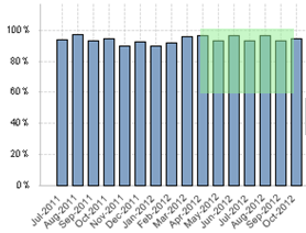
To focus the chart on a particular set of data points, click and drag the mouse pointer over the chart so that all of those data points are included in the green selection area.  Illustration
To focus the chart on a more restricted analysis period, do either of the following:
-
Specify the analysis period using the analysis period bars at the top of the tab.  Illustration
-
Click and drag the mouse pointer over the chart so that the green selection area touches only the chart line data points for the months, quarters, or years you want to include.  Illustration
It is much easier to make selections on the chart itself if you first maximize the chart.
If you use any of the above actions to change the chart, Costpoint Analytics applies the same changes, as appropriate, to all other analytic objects.
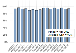
To see the labor utilization for a specific fiscal period, position the mouse pointer over the bar for that period. Costpoint Analytics displays the labor utilization in a data box.
It is much easier to position the mouse pointer over a data point if you first maximize the chart.
 Illustration
Click  to change the view from the chart to a table. Click the same button to return to the chart view. More...
Click  to send the data underlying
the chart to Microsoft Excel. More...
![]()


