Top 10 AR Chart
|
Chart Item
|
Description
|
|
Horizontal axis: organizations, customers, project types, project managers, or projects
|
The horizontal axis displays the ten organizations, customers, project types, project managers, or top-level projects with the highest current AR balances.
By default, this chart displays AR balances for organizations. However, you can use the Cycle button ( ) next to this axis to display top 10 AR balances for customers, project types, project managers, or projects. ) next to this axis to display top 10 AR balances for customers, project types, project managers, or projects.
|
|
Vertical axis: AR amounts
|
The vertical axis displays the range of AR amounts.
|
|
Stacked bars: AR amounts by aging range
|
On the stacked bar chart, each bar represents the total AR balance for the organization, customer, project type, project manager, or top-level project.
Each segment in a stacked bar represents the AR amount for one of the aging ranges.
|
|
Data Item
|
Description
|
|
Total AR amount for an organization, customer, project type, project manager, or project
|
The sum of invoice balances for that organization, customer, project type, project manager, or top-level project as of the current date.
|
|
AR amount for an aging range
|
The sum of invoice balances for that organization, customer, project type, project manager, or top-level project for invoices with an age in that aging range.
|
|
Total AR amount
|
The sum of invoice balances for all of the organizations, customers, project types, project managers, or top-level projects included on the chart.
|
For more information on AR data and how invoices are aged, see AR and DSO: Data Sources and AR and DSO: Key Concepts.
Click  at the top right of the chart
to display the chart at its maximum size. Click
  to restore the chart to its original size and location on the tab.
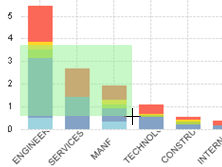
To focus the chart on a particular set of organizations, customers, project types, project managers, or top-level projects, click and drag the mouse pointer over the chart so that all of those bars are included in the green selection area.  Illustration
To focus the chart on one or a few aging ranges, do either of the following:
It is much easier to make selections on the chart itself if you first maximize the chart.
To focus the chart on a more restricted analysis period, specify the analysis period using the analysis period bars at the top of the tab.  Illustration
If you use any of the above actions to change the chart, Costpoint Analytics applies the same changes, as appropriate, to all other analytic objects.
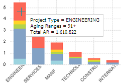
To see the exact AR amount for an organization, customer, project type, project manager, or top-level project for a specific aging range, position the mouse pointer over that segment in the bar. When you do, Costpoint Analytics displays the organization, customer, project type, or project manager, the aging range, and the AR amount in a data box.  Illustration
It is much easier to position the mouse pointer over a narrow segment if you first maximize the chart.
Click  to send the data underlying
the chart to Microsoft Excel. More...
![]() ) next to this axis to display top 10 AR balances for customers, project types, project managers, or projects.
) next to this axis to display top 10 AR balances for customers, project types, project managers, or projects.


