You can analyze current pipeline, pipeline revenue forecast, and historical pipeline based on probability ranges. Use the Probability Ranges table to specify up to five ranges you want to use.
You specify the following probability ranges in Probability Ranges:

When your firm's executives use the Current Pipeline Analytics, they can display pipeline data summarized based on these ranges in the following tables and charts:
Current Pipeline Breakout chart
Current Pipeline Amount and Count table
Current Pipeline Amount chart
Current Pipeline Count chart
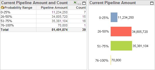
For example, they could display a Current Pipeline Amount and Count table and a Current Pipeline Amount chart similar to the following:

They can also analyze data based on pipeline probability ranges using the Pipeline Revenue Forecast Analytics and the Historical Pipeline Analytics.
For the benefit of those who will use the analytics, it is recommended that you use labels that contain the numeric values of the range, as illustrated in the example above.
You do not have to set up all five possible ranges. However, the ranges that you define should include all possible probability percentages from 0 to 100.
To enter probability ranges...
In the Probability Ranges table, click the down arrow at the end of the From cell for the first range.
Enter the lowest possible percentage for that range, and press the TAB key. For the first row, enter 0 for 0 percent.
In the To cell for the first range, enter the highest possible percentage for that range, and press the TAB key. For example, enter 25 for 25 percent.
In the Label cell for the first range, enter the range description that you want Capture Analytics to display for the range on the Pipelines tab (0 - 25%, for example).
Press the TAB key to move to the next range.
Repeat steps 1 – 5 for each range you want to define. For the last range, enter 100 in To.
Normally, you do not change these settings after the initial configuration. However, you can change them at any time.